On-Track
A Carnegie Mellon Capstone Project with UPMC Enterprises
- Field Research
- Experience Design
- Functional Prototyping
- Videography
- Concept Video Editing and Effects
About This Project
While this is a student project, I include it in this portfolio because it allowed me to explore a problem space more thoroughly, diving deep into research, synthesis, and design. It has established a solid foundation, which I have built upon since in the 5+ years working in the industry.
This project was a collaboration with my capstone project team, Anna Malone, Diya Deb, Mike Szegedy, and Tina Jose. We also co-authored this article. The version you are reading on this site contains my adaptations to fit this portfolio. (The curious can see the article as originally posted )
The Problem With Readmissions
Readmissions cause both emotional and financial stress for patients and caregivers. Many of these readmissions can be prevented if patients better understood how to care for themselves following their hospital discharge.
Readmissions & Discharge Planning
UPMC Enterprises charged our team with coming up with a solution to help reduce readmissions by exploring the discharge planning process.
We were asked to create a tool that addressed factors outside the hospital that are critical to patient outcomes, like a patient’s support system, transportation, access to follow-up care and more. Our task was to support clearer communication and planning around these “soft factors” during care transitions, ultimately reducing a patient’s risk for readmission.
Our Vision
We chose to focus on a collaboration tool to improve communication between patients and providers during discharge planning, so that
- Providers can better understand patients’ lives outside the hospital.
- Patients can more fully clarify, understand, and even shape and co-create their plans.
- Chronic disease patients’ adherence to care instructions will improve, due to a sense of ownership and empowerment, leading to better health outcomes and reduced readmission rates.
Status Quo Today
- Discharge plans are based on medical conditions
- Patients are overwhelmed once they get home
- Patients are asked the same questions over and over again; and questionnaires are tedious
- Patients are given instructions and don’t know that they can ask for alternatives
- Patients have trouble following abstract instructions like “follow a low-sodium diet”
Our Vision for Tomorrow
- What is meaningful to each patient is incorporated into their plan
- Patients are encouraged to plan ahead while they’re at the hospital
- Providing information is fun and engaging for patients
- Patients co-create their discharge plan with providers so they have a greater sense of ownership
- Patients get actionable suggestions that meet them where they are at, helping them make baby steps
“Noting the patients’ current state and giving them small, baby-step changes that would impact them now will incentivize them to make bigger changes later.”
Care Manager
Due to the confidential nature of this project, we cannot share any details about our research findings or final product. Read on to learn more about our process and methods.
Researching the Domain
Literature Review
We reviewed papers and articles to understand why readmissions are a problem and identify the medical conditions for which readmissions can be prevented.
Healthcare Landscape
Using the domain knowledge gained from our literature review, we created a visualization of the healthcare landscape and mapped out all the stakeholders involved.
Our Competitors
We researched competitors in the discharge planning space to identify gaps and missed opportunities in the market.
We conducted research to gain an end-to-end view of discharge planning by looking at a patient’s journey from hospital stay, to discharge, to the home.
Exploring the Patient’s Journey
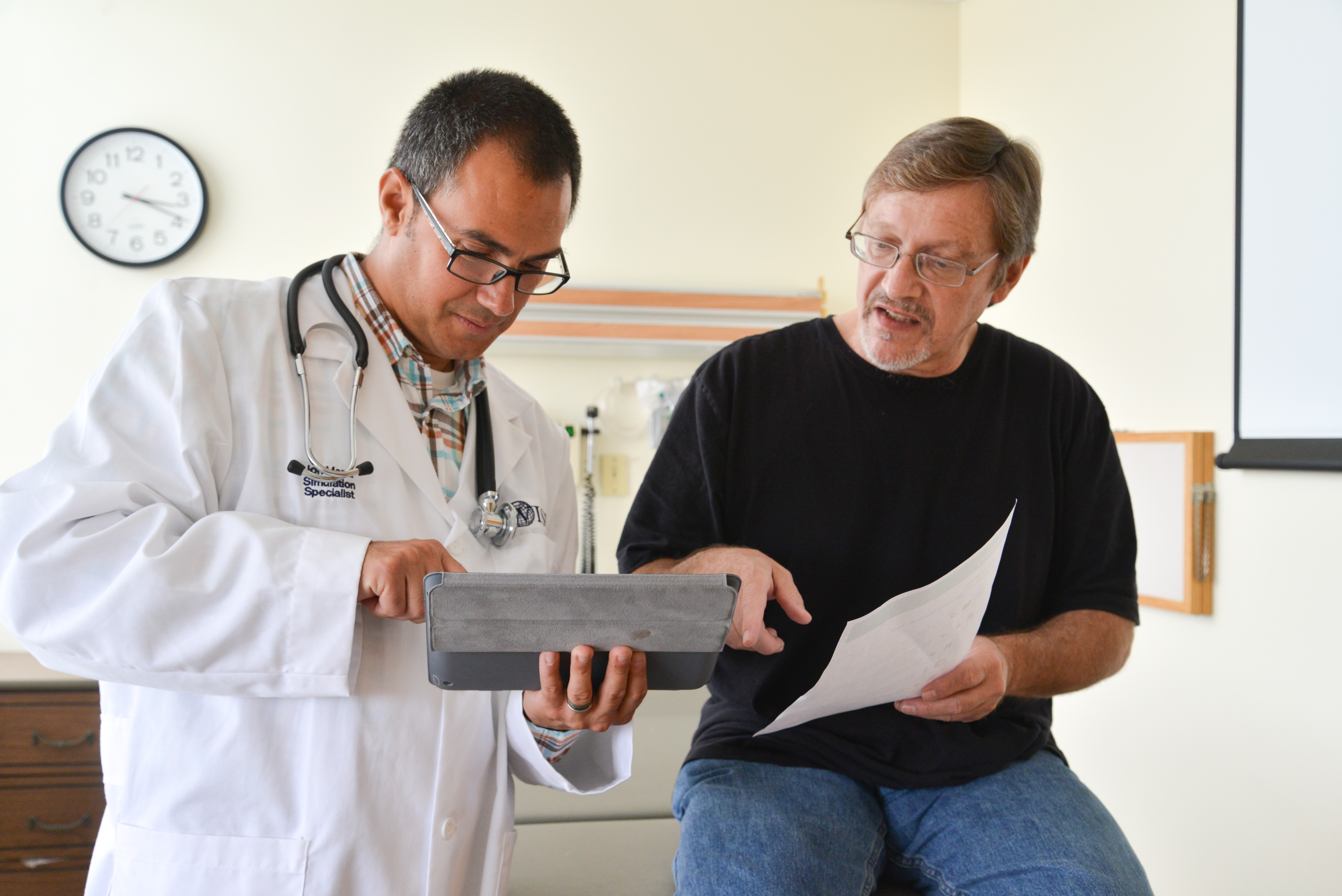
Meeting with a Care Manager to gain feedback on our design. We observed how each role in the discharge team interacted with the patients and with each other during in-depth shadowing sessions. We identified pain points and opportunities for increased collaboration during these interactions.
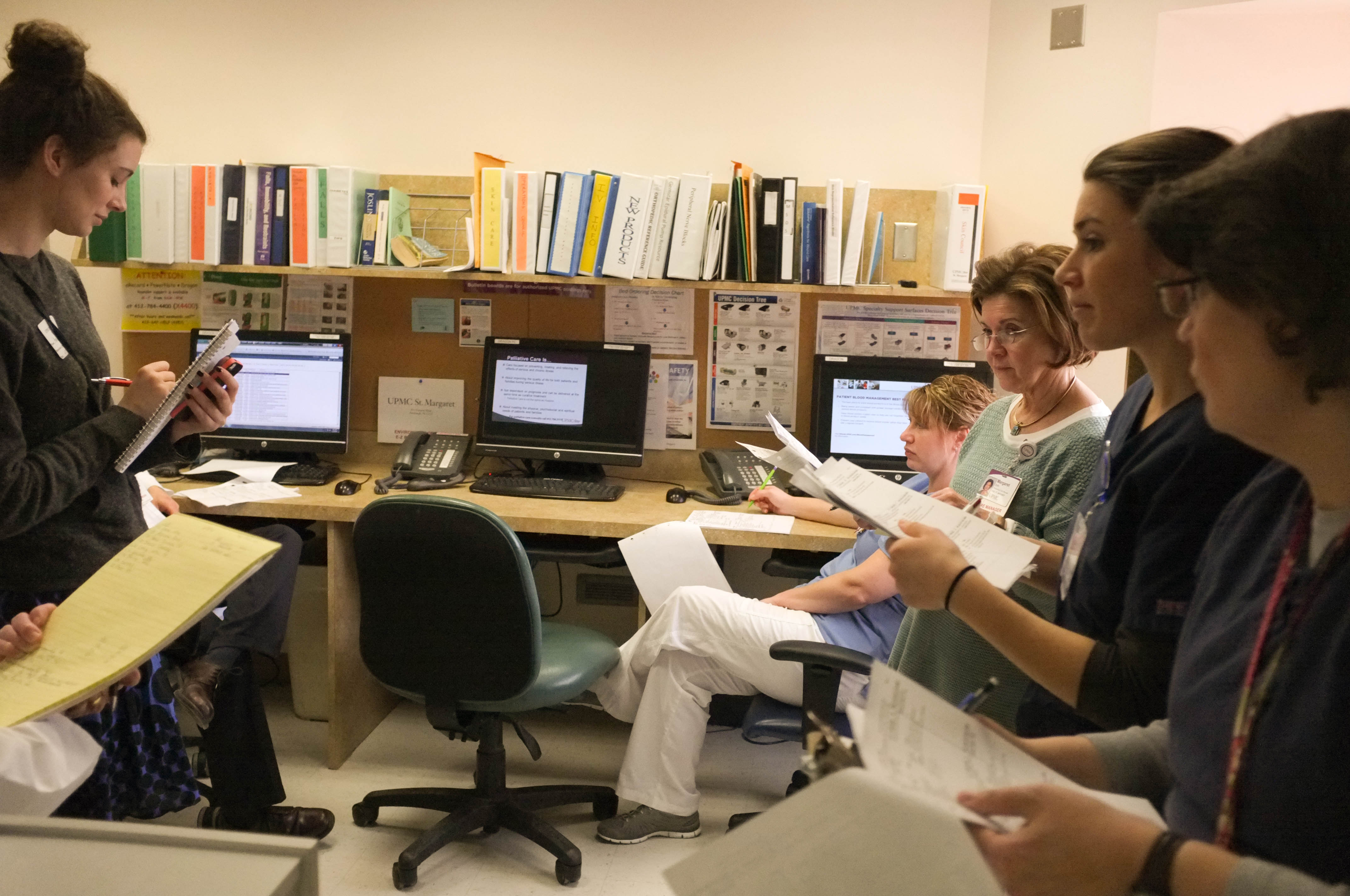
Observing hospital staff meet together to discuss the needs of each patient first-hand. We consulted experts in healthcare, care administration, pedagogy, human-computer interaction, and service design throughout our process to gain insight into how we could increase patient engagement and improve patient-provider communication at hospitals.
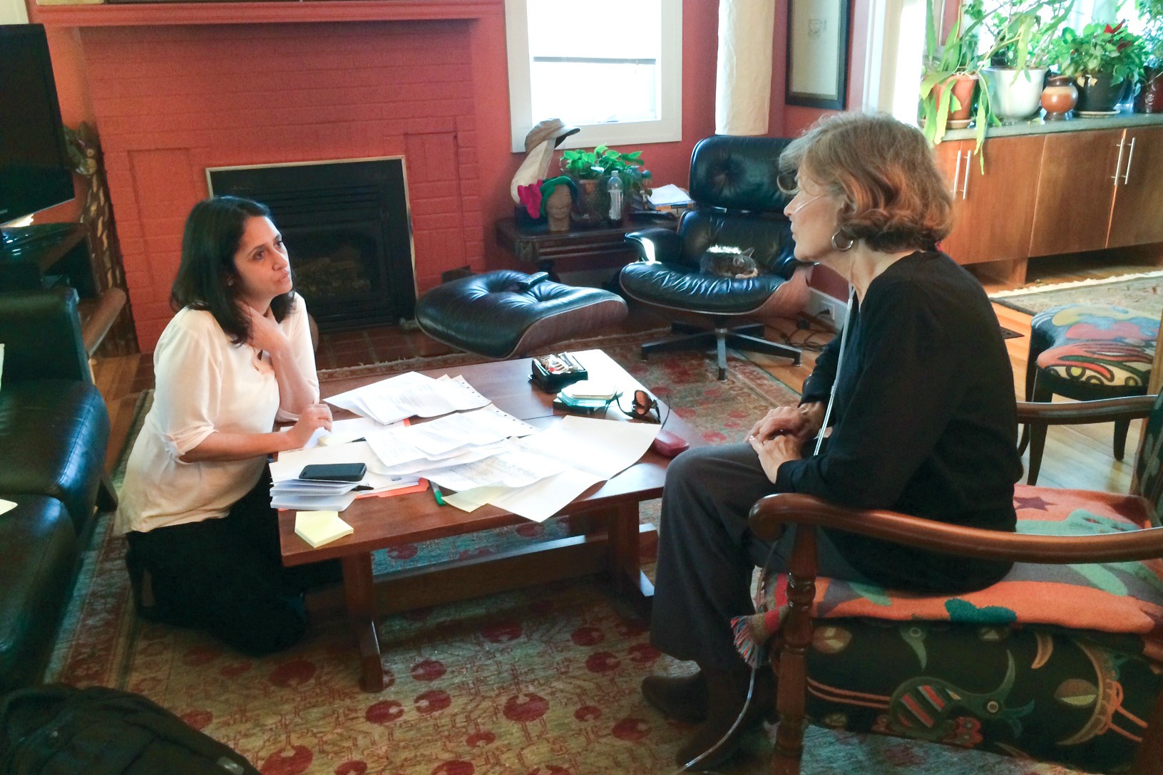
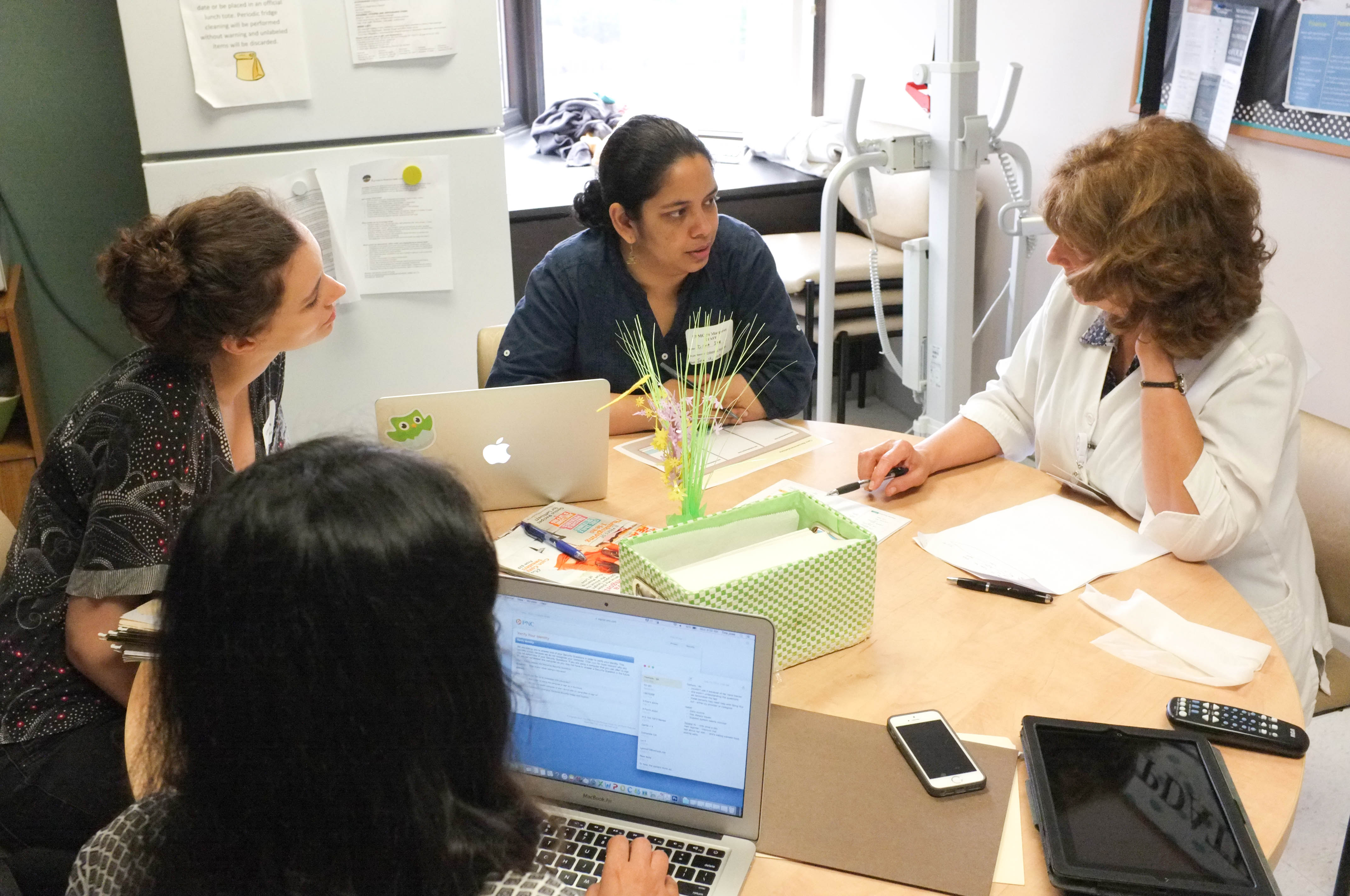
Tina interviewing a former patient of her experience. To gain in-depth understanding of a patient’s experience during the discharge process and after, we interviewed over 15 patients who were recently discharged from the hospital. We also visited them in their homes to see where they kept their discharge packets and how they managed their complex medication regimen.
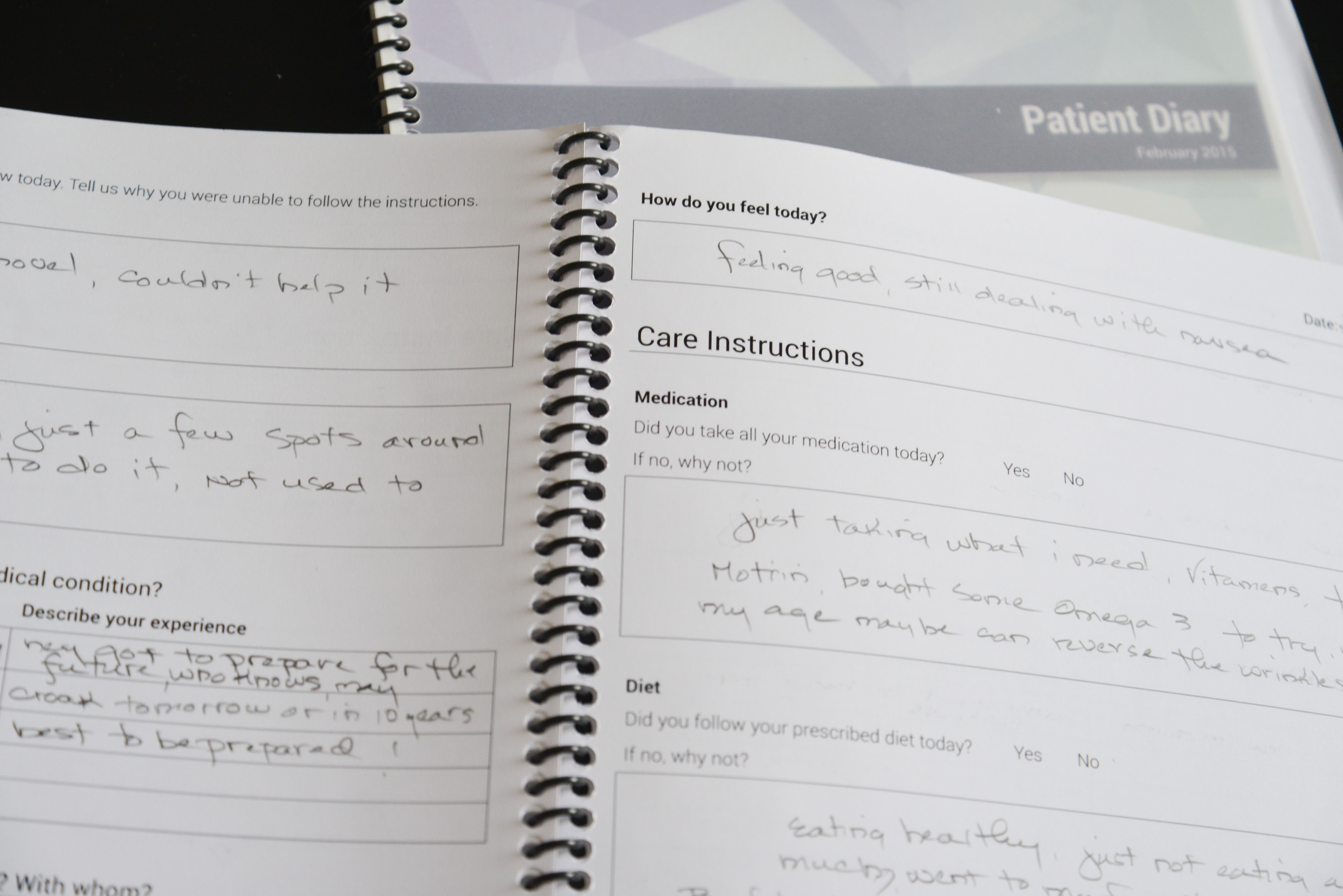
Former patients wrote candidly how they felt days after being discharged from the hospital. We gave diaries to patients so they could record their thoughts and feelings for 10 days after discharge from the hospital. They also recorded if they were able to follow their care instructions each day, as well as personal obstacles and challenges that made following instructions difficult.
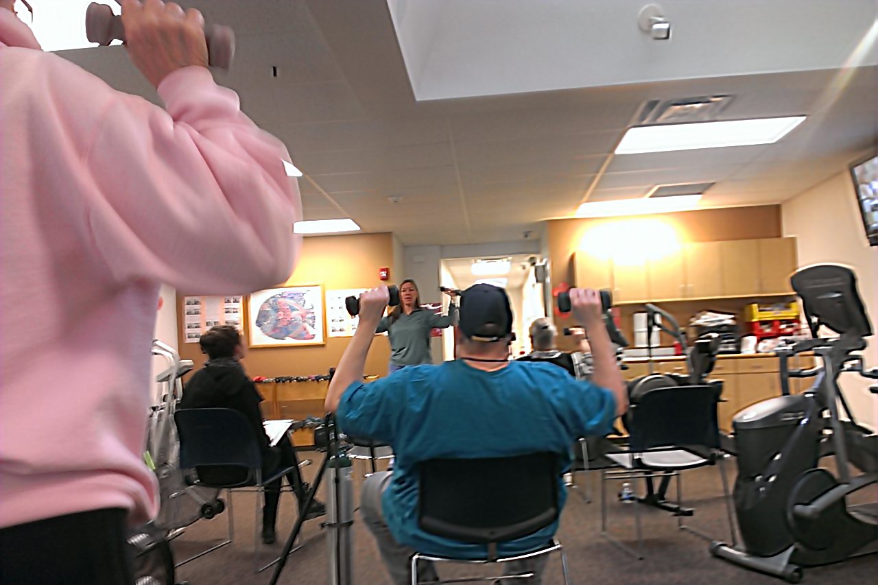
The relationship between the staff at the cardiac rehab facility and the patrons was inspiring for our research. Through interviews, we found that heart failure patients who visited cardiac rehab facilities had lower readmission rates than those who did not. We gained access to a rehab facility where we observed some of the best practices used in keeping the patient motivated.
Generating Insights From Our Research
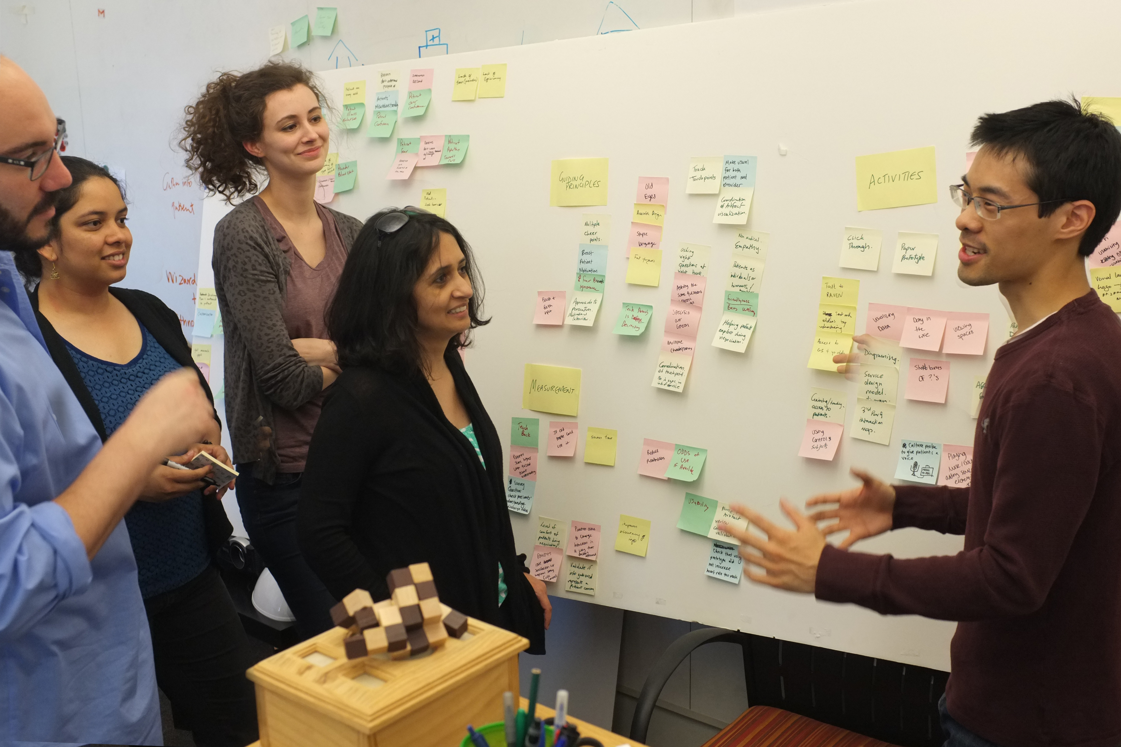
The team coming up with design ideas while 'walking the wall’.
Our interviews and shadowing sessions generated over 1,400 notes which we grouped into meaningful clusters using an affinity diagram. We used this process to draw high-level insights that provided the basis for generating design ideas.

Personas helped guide our understanding of the patients’ needs.
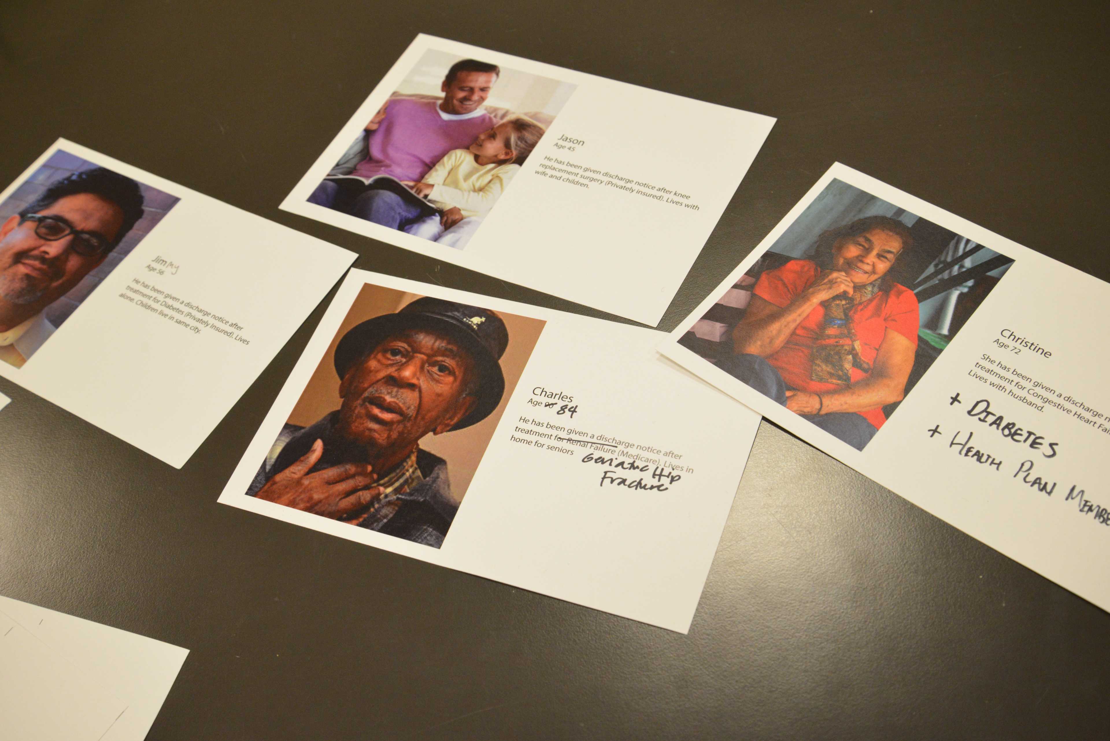
Through our primary research, we discovered the common behaviors, thoughts, and feelings that influence non-compliance, synthesizing these findings to create patient personas. We also used findings from our literature review to decide on the medical conditions and age group for the personas we developed.
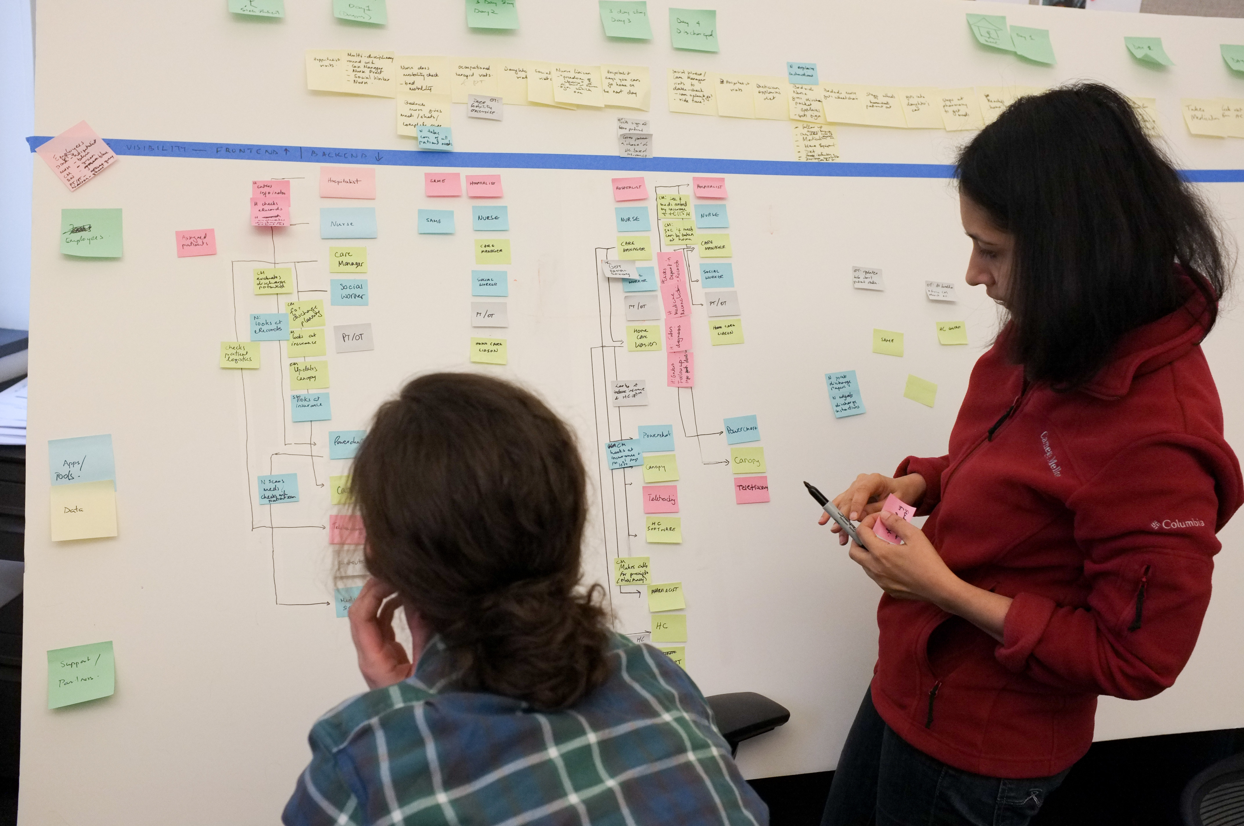
We came across a variety of stories about patients’ care transition journeys. We synthesized this information to create a hospital journey, focusing on opportunities for additional collaboration between patients and providers in creating the discharge plan.
Establishing a Vision for the Product
Setting the Direction
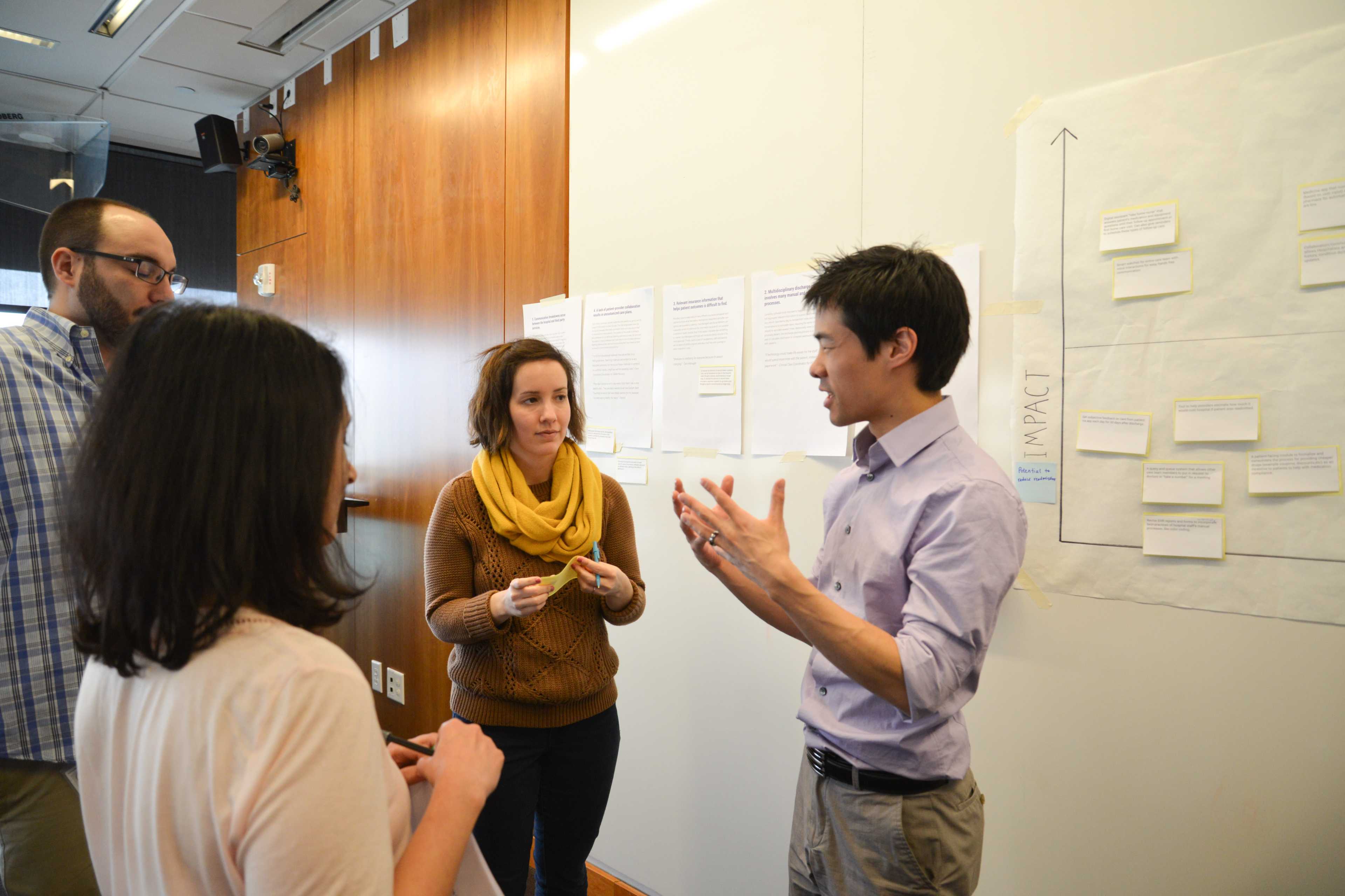
To understand what design ideas would be most feasible and have the highest impact, we created a short-list of 40 ideas of possible solutions based on 10 of our top findings. We then asked our client to map these ideas to an impact vs. feasibility matrix while explaining their rationale.
Testing Our Early Visions
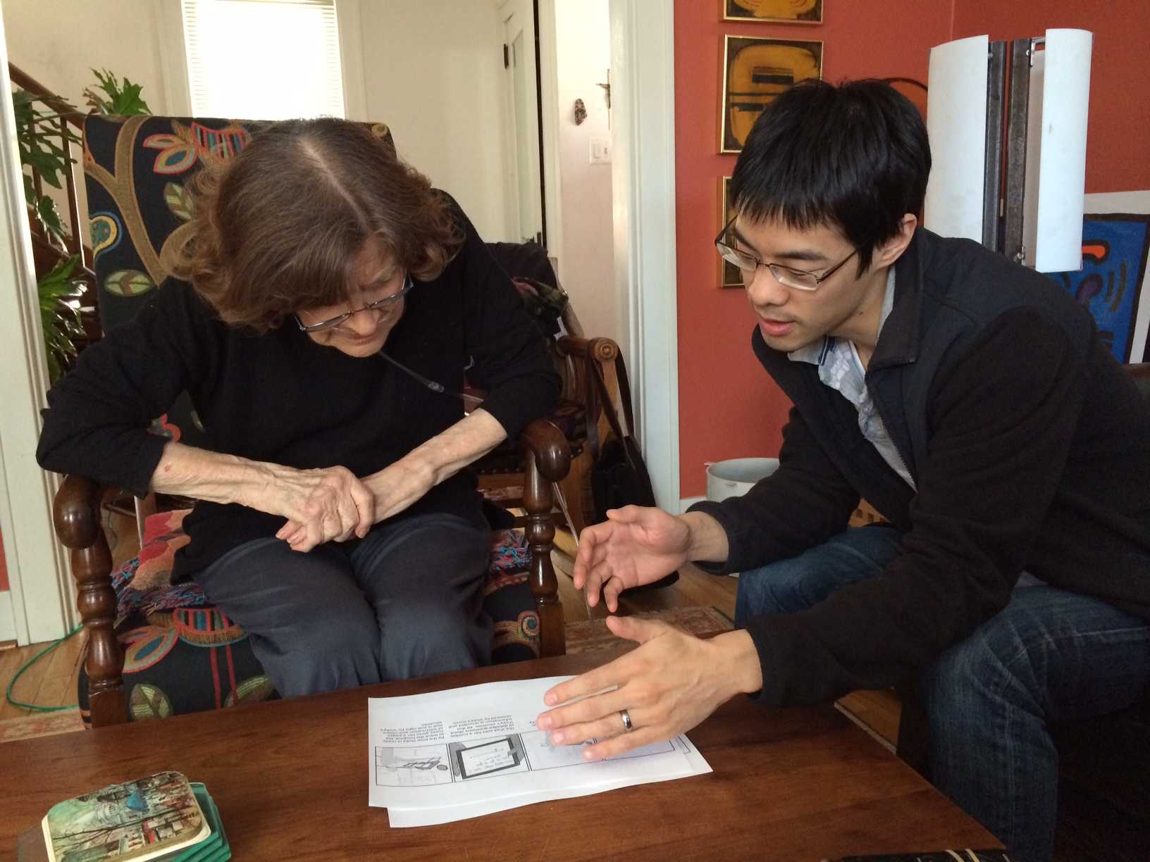
To validate the need for certain features, we created storyboards and shared them with providers and patients to get their quick reactions, as well as trigger deeper conversations about their needs.
Creating a Collaboration Tool
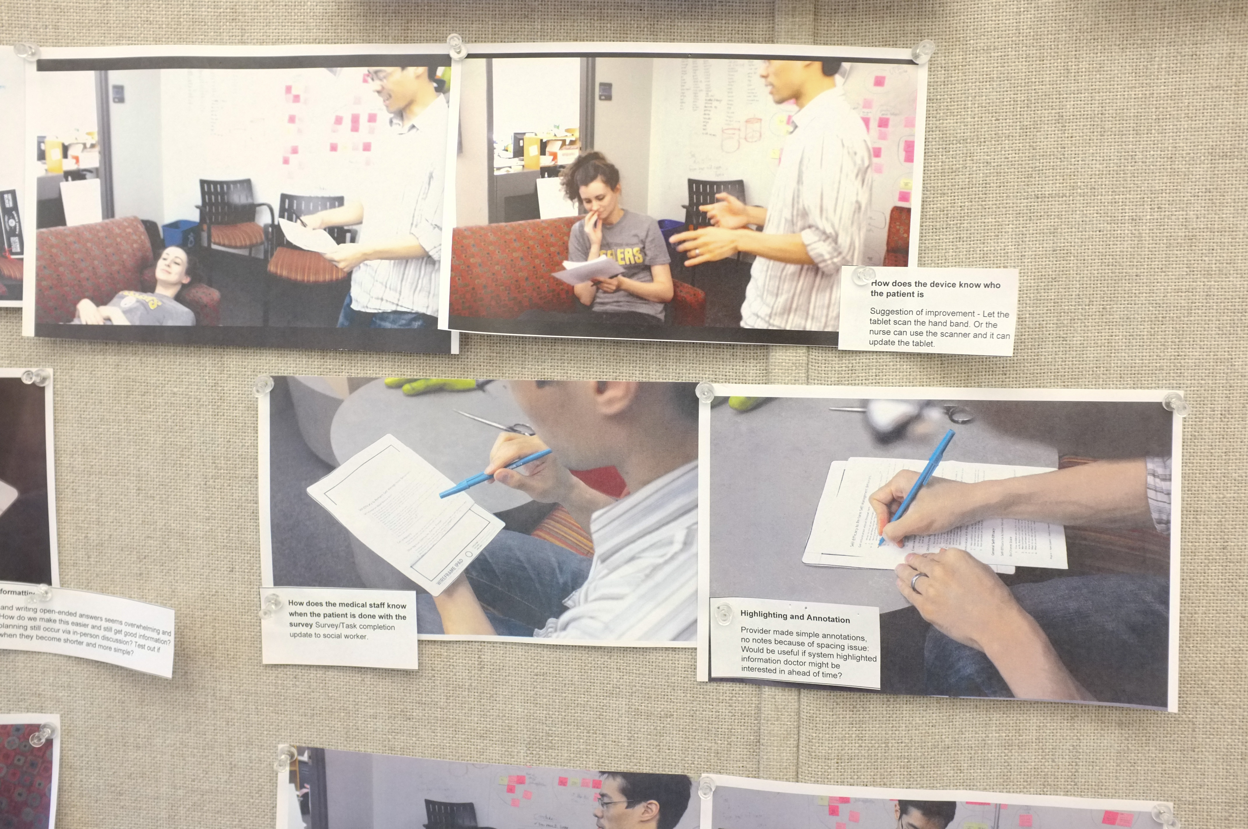
Images from a bodystorming session.
We used generative role-play to brainstorm what tablet interactions might be effective and engaging in the context of a hospital space.
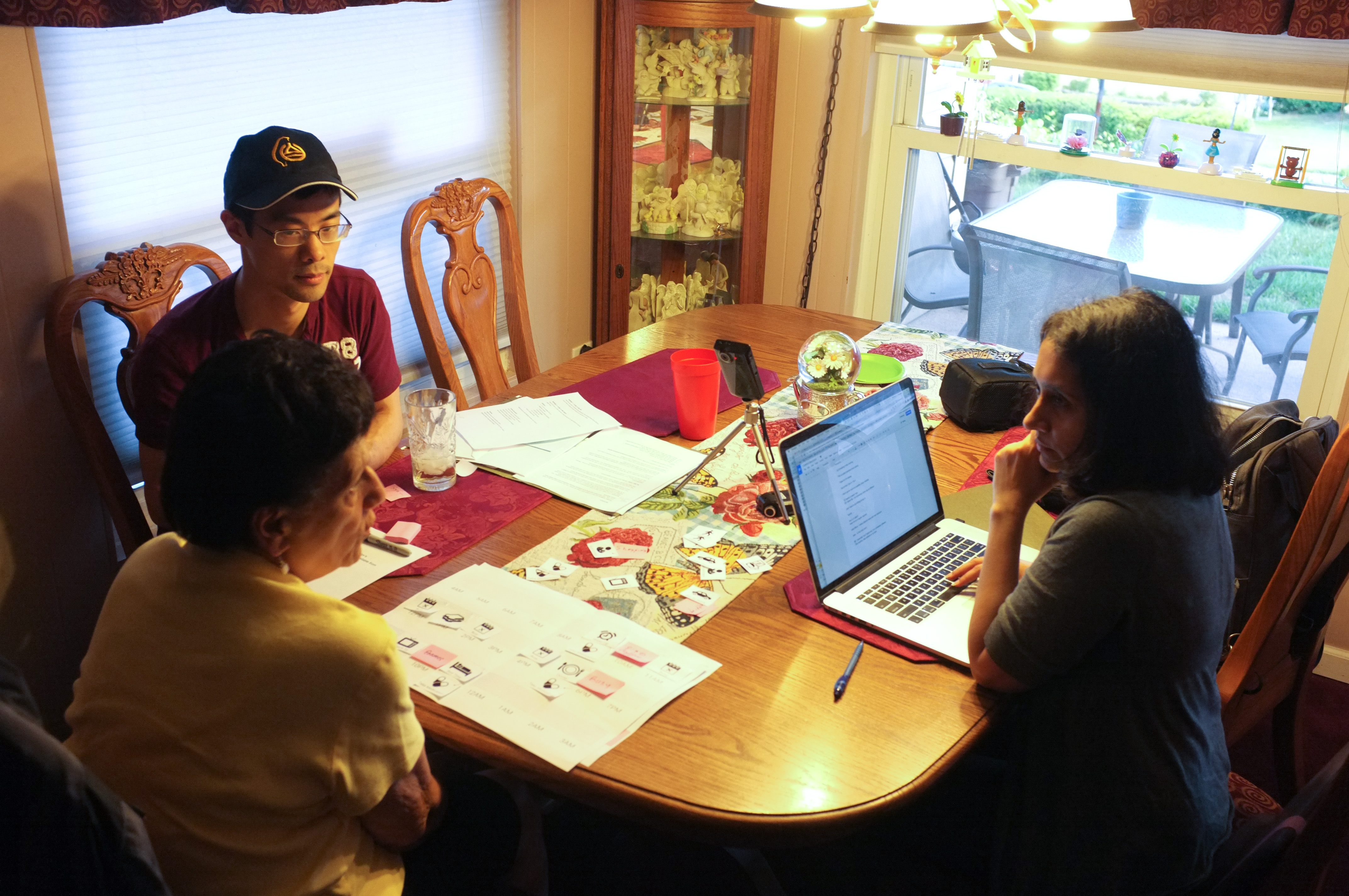
Tina and I listening to a study participant during a paper prototyping session.
Next, we tested our best interface ideas with patients and providers using paper prototypes to discover which interactions they found most effective and engaging.
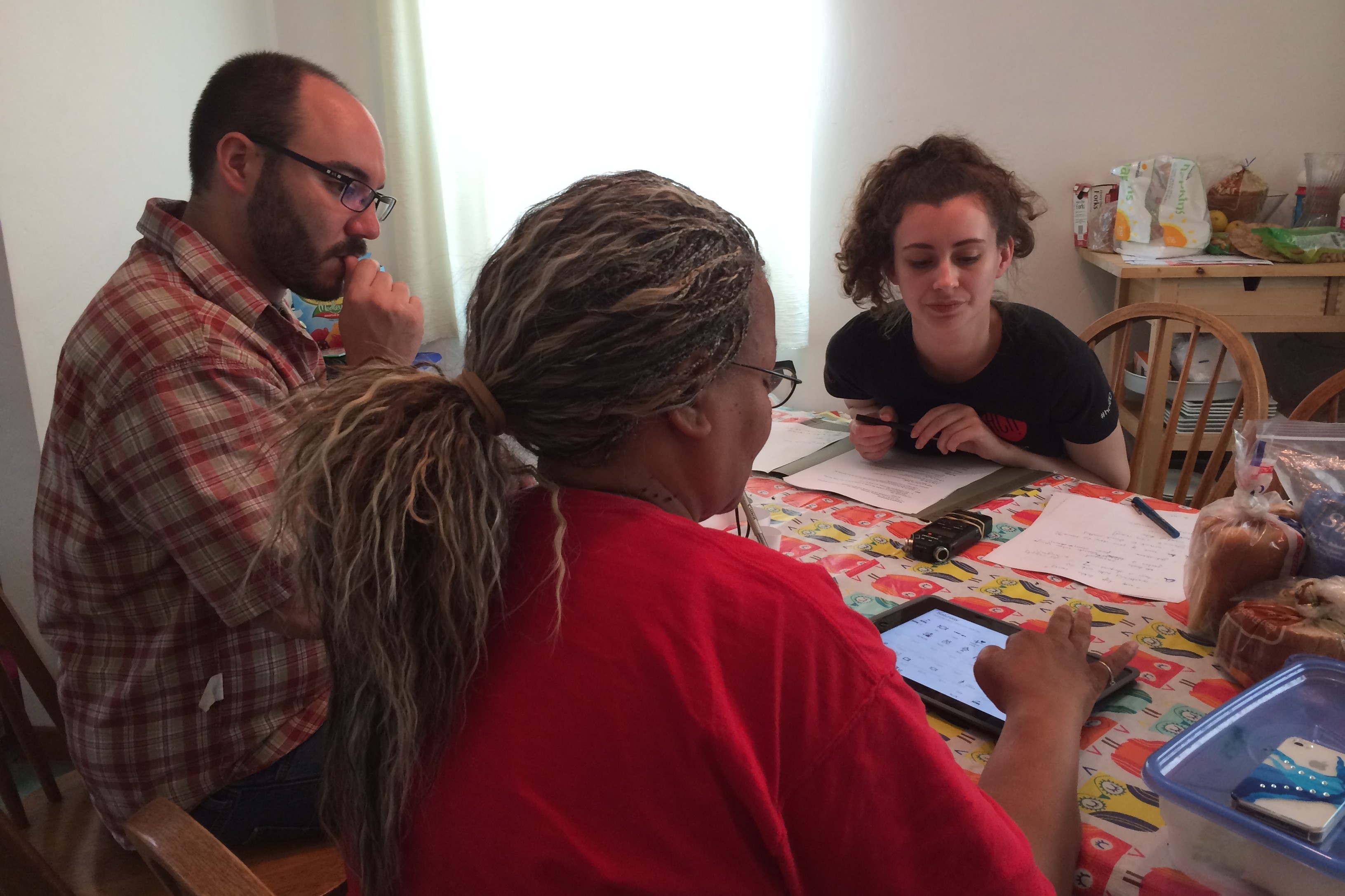
Mike and Anna meeting gaining valuable feedback on our design from former patient.
After selecting the most effective interaction base, we created semi-functional wireframes and tested how usable patients found each screen.
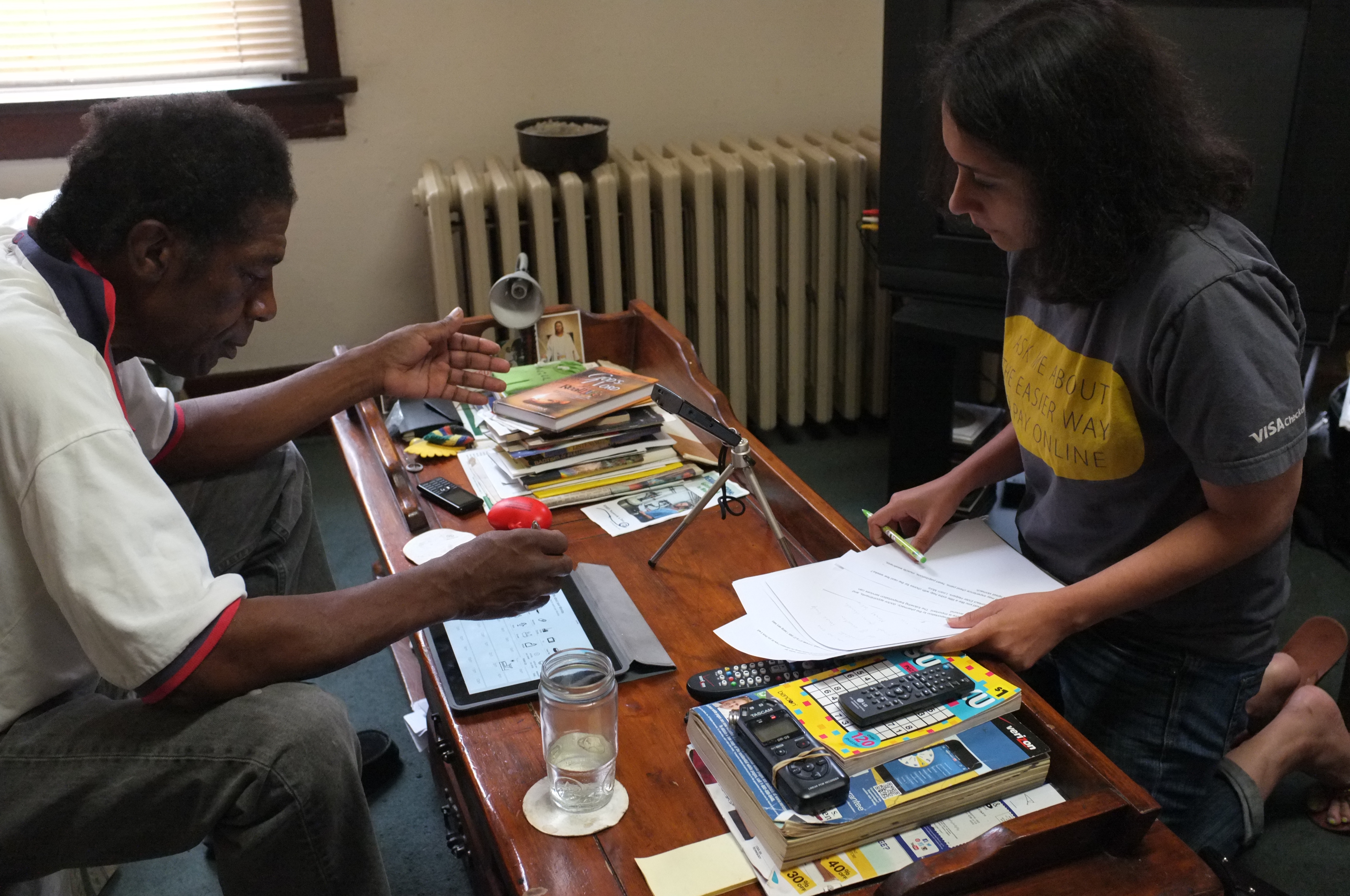
Tina conducting a test of our interactive prototype.
We worked in the backend to manually simulate and test features that weren’t yet functional, but that we intended to include in our final design.
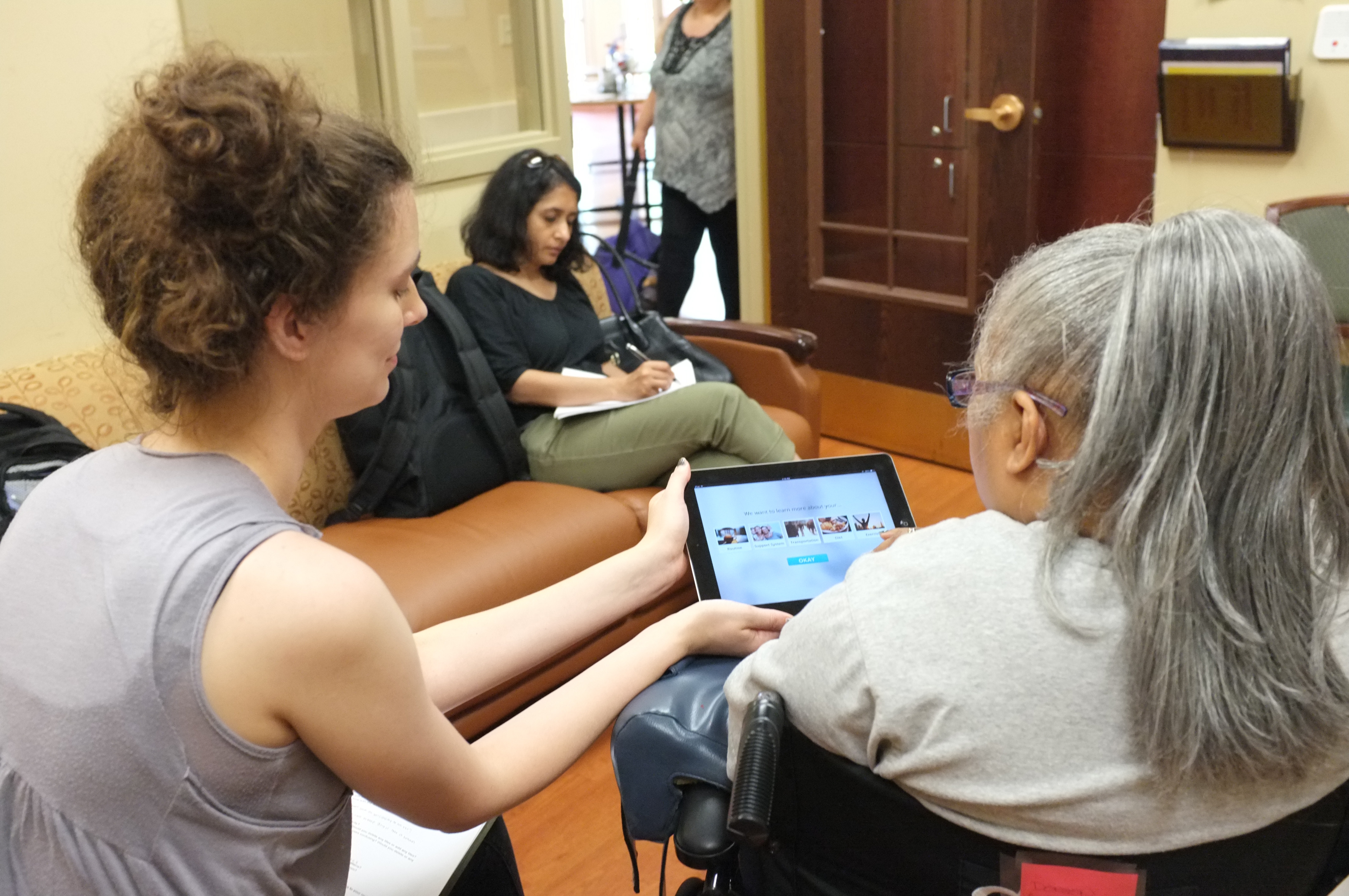
Anna administering a usability test with a former patient, and Tina taking notes.
Knowing our target audience was older, we wanted to make sure they found the design easily accessible. We employed a full range of fidelity in our testing, from paper to code.
Test the Interactivity
Concerned for our older patients, we wondered what range of input methods we could use. Did they prefer drag-and-drop or tap to pick up? We decided to create a prototype that replicated the nuances of interactivity.
Web-enabled Field Testing
Because the prototype was web-based, we could test it in the field on any tablet, wherever we had Internet. We connected our prototype to a database, so healthcare providers could view responses to see whether it would lead to more informed discussions between them and the patients.
The Prototyping
I used my custom-made prototyping library, which I now use for prototypes of web applications that require a high degree of interactivity. It includes web technologies such as Angular.js, and others.
Testimonials
“This application is engaging because it shows interest in me as an individual. These are things about me the hospital should know, and they don’t ask those questions now.”
Mary, Heart Failure Patient
“This is fun! It’s like playing solitaire or bingo!”
Dora, Diabetes Patient
“I think this would be awesome. Especially for someone who is new to medicine, just had a heart attack or something. It would help caregivers, nursing home staff, or a patient who lives alone to have the most important instructions sectioned out and easy to read like this.”
Caregiver
Final Deliverables
Concept Video
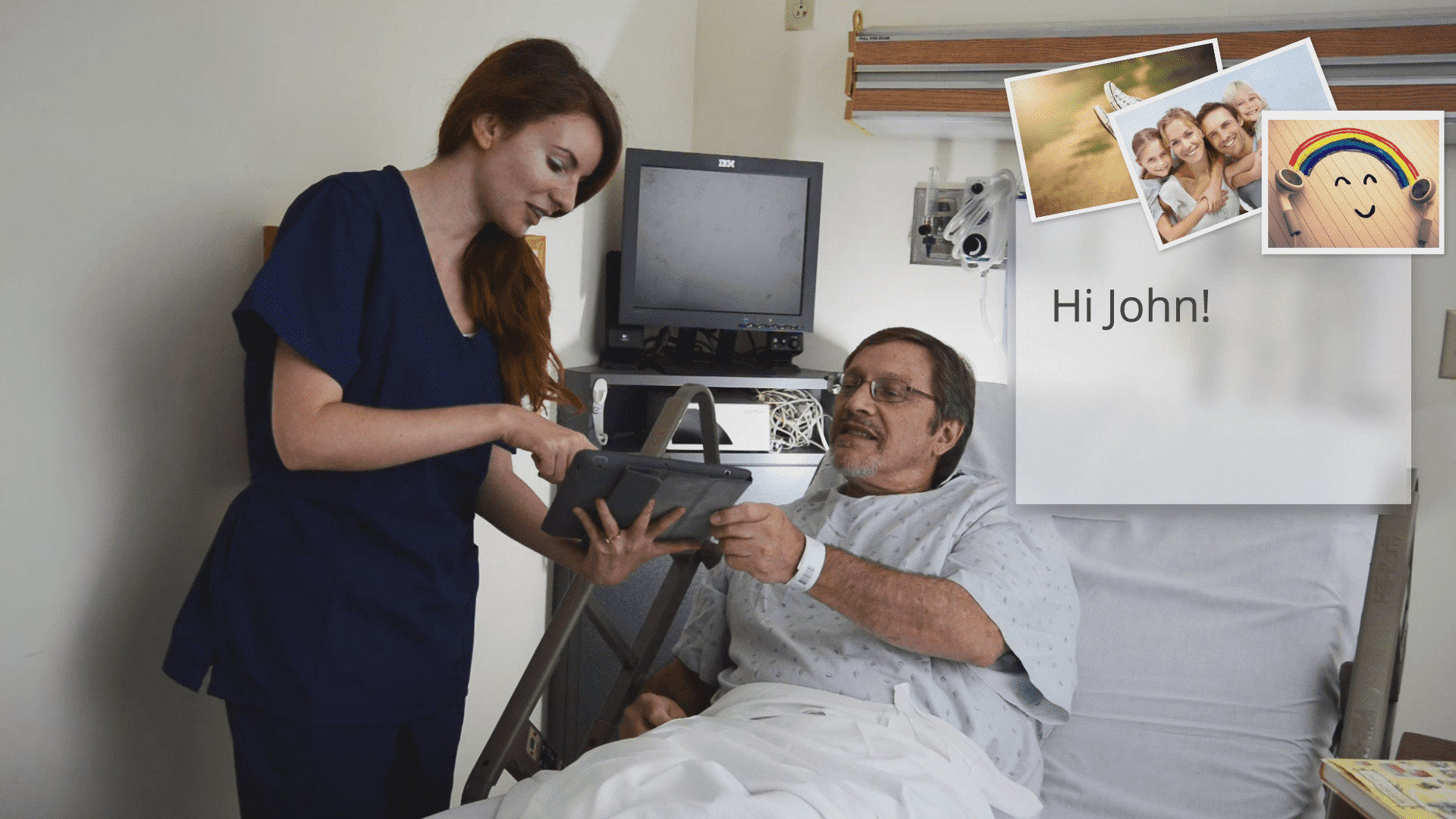
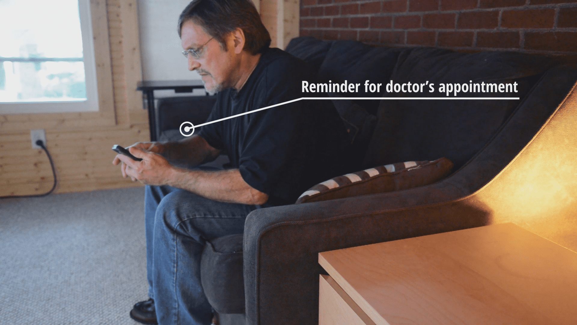
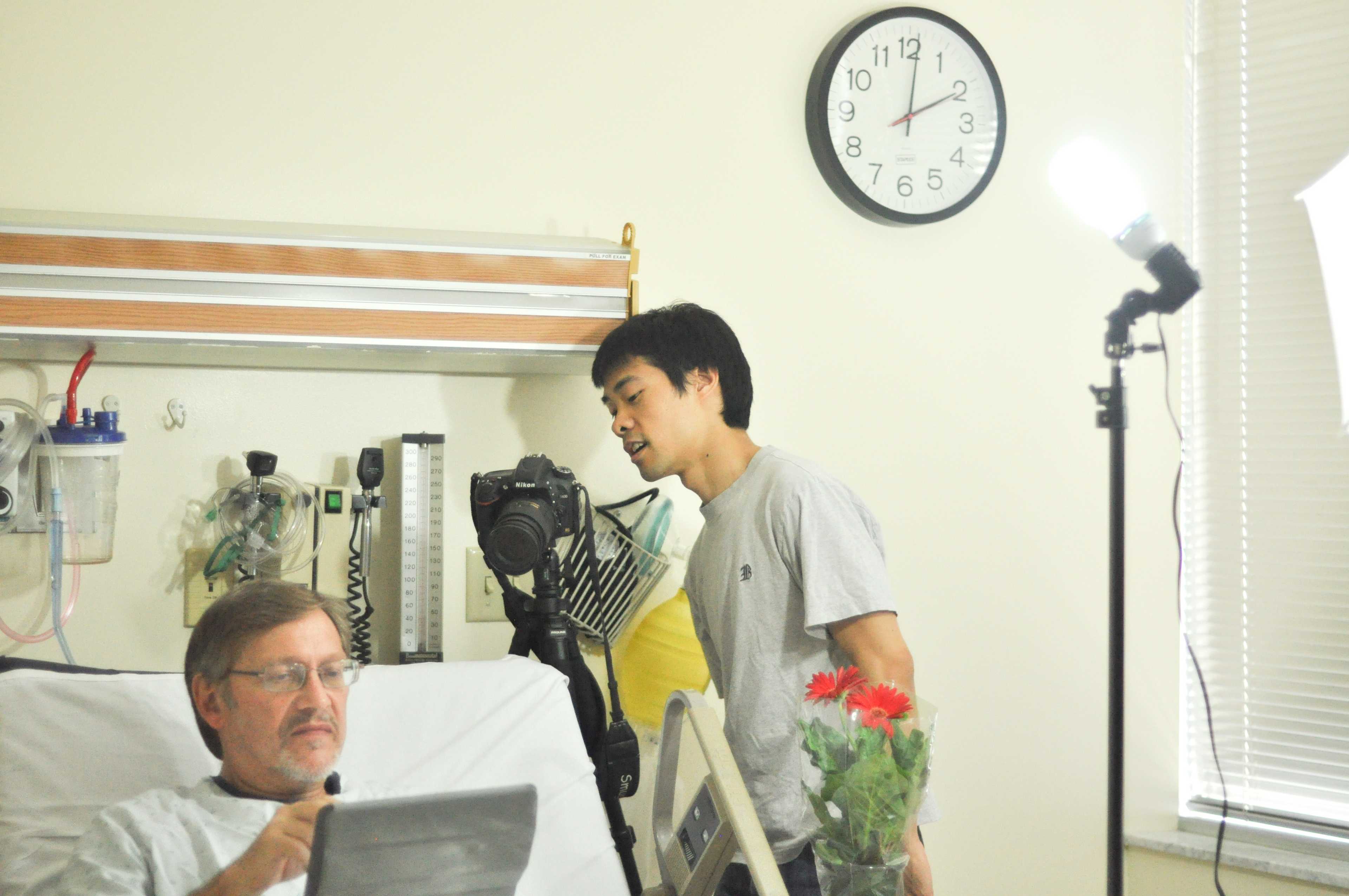
Our client asked us to create a 3-minute concept video to quickly communicate our design concept to other stakeholders. I played a major role in the making of the video, from camera work throughout post-production.
Through the film, I wanted to convey the big vision and concept and the personality and interactivity of the solution. (Detailed screenshots redacted.)
Other Deliverables
- a high-fidelity, interactive prototype
- a web-based, functional prototype
- a 40-page research report
- a 40-page design report
- 2 × 40-minute presentations
Evaluation Criteria & Next Steps
Within our scope and timeframe, we weren’t able to pilot our solution at the hospital. Before implementing our solution, we strongly recommend that UPMC conduct a pilot within the app’s intended environment of use. The pilot should include a sample of patients using OnTrack and a control group. The effectiveness of OnTrack should be evaluated along the following metrics:
Communication
Does OnTrack reduce miscommunication, helping patients, caregivers, and hospital staff coordinate better?
Workflow
Will OnTrack account for all of the staff’s logistical challenges, or should some revisions be made?
Adoption
Do hospital staff continue to use the inpatient component of OnTrack through the entire length of the pilot? Do patients continue to use the outpatient component of OnTrack for the entire 30-days after discharge?
Adherence
Are patients using the inpatient and outpatient components of OnTrack more likely to adhere to their care instructions than the control group?
Reduced Readmissions
Are patients using OnTrack less likely to be readmitted within 30 days than the control group?