Color Palette Revamp
July 01, 2021
Overview
Why read this?
This article might be helpful for anyone looking to systematize the color palette of an existing site or interface or creating a design system from components designed separately.
As you’ll see, the approach I took was to ask what the roles every color played in the interface and then unify from there.
I’ve used a similar approach while creating a design system for a family of plugins, looking at the jobs to be done for various UI components.
Problems Observed
I originally put together this site in full “hacker” mode, putting things of design aside. Unfortunately, doing that left several problems with the color palette:
- Colors were assigned organically and individually per page element without regard for the system as a whole.
- It has too many colors in the palette, and not all of them are used.
- As indicated by Lighthouse, there is often too little contrast, making the site less accessible.
The Steps I Took
- Audit the site, looking for all mention of color in the code.
- Note all the jobs performed by the colors.
- In the code, create design tokens according to the job.
- Refactor components to use design tokens instead of referencing color values directly.
- Consolidate any duplicate tokens.
- Revise the color palette, meeting goals of simplicity, accessibility (contrast), and aesthetic style.
- Meanwhile, monitor changes to a test page to ensure the desired effect is achieved. The test page is something that stores a variety of scenarios. (For me, I’ll be using a test page for Visual Essay.)
- Document the rules. ("For my own site!?" you might ask. Well, yeah. I’m not working on this every day. I forget.)
Site Audit & Analysis
I searched the code for all assignments of color, noting what job the color was performing.
The following is what I found:
Jobs Performed by Color (Without Optimization)
Overall, I like how the current colors are nuanced enough to help distinguish visual elements in detail, but to an extreme.
Backgrounds
Text
Graphics
Revamp Results
I reduced the color palette from 19 to 11 colors.
I also checked color combinations for accessibility and resolved issues.
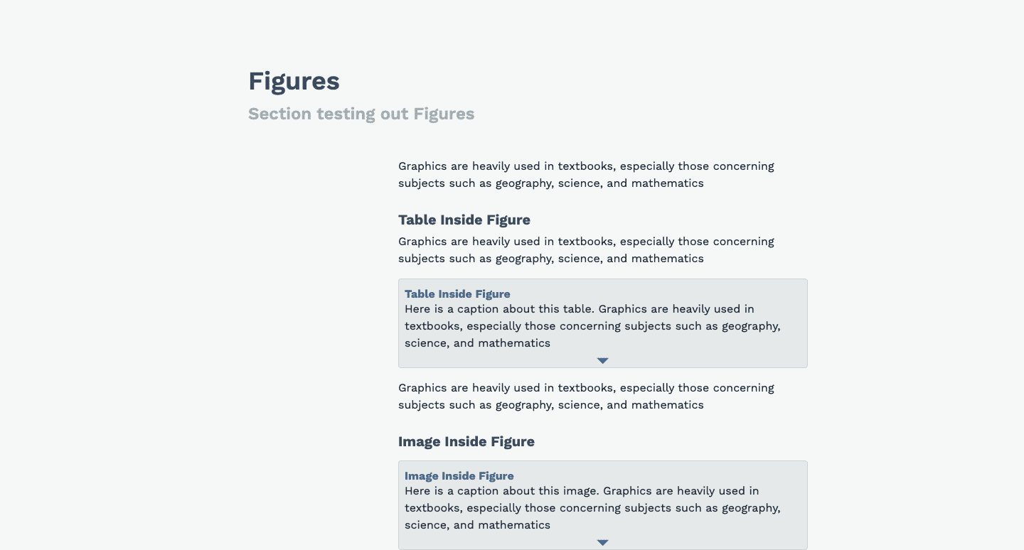
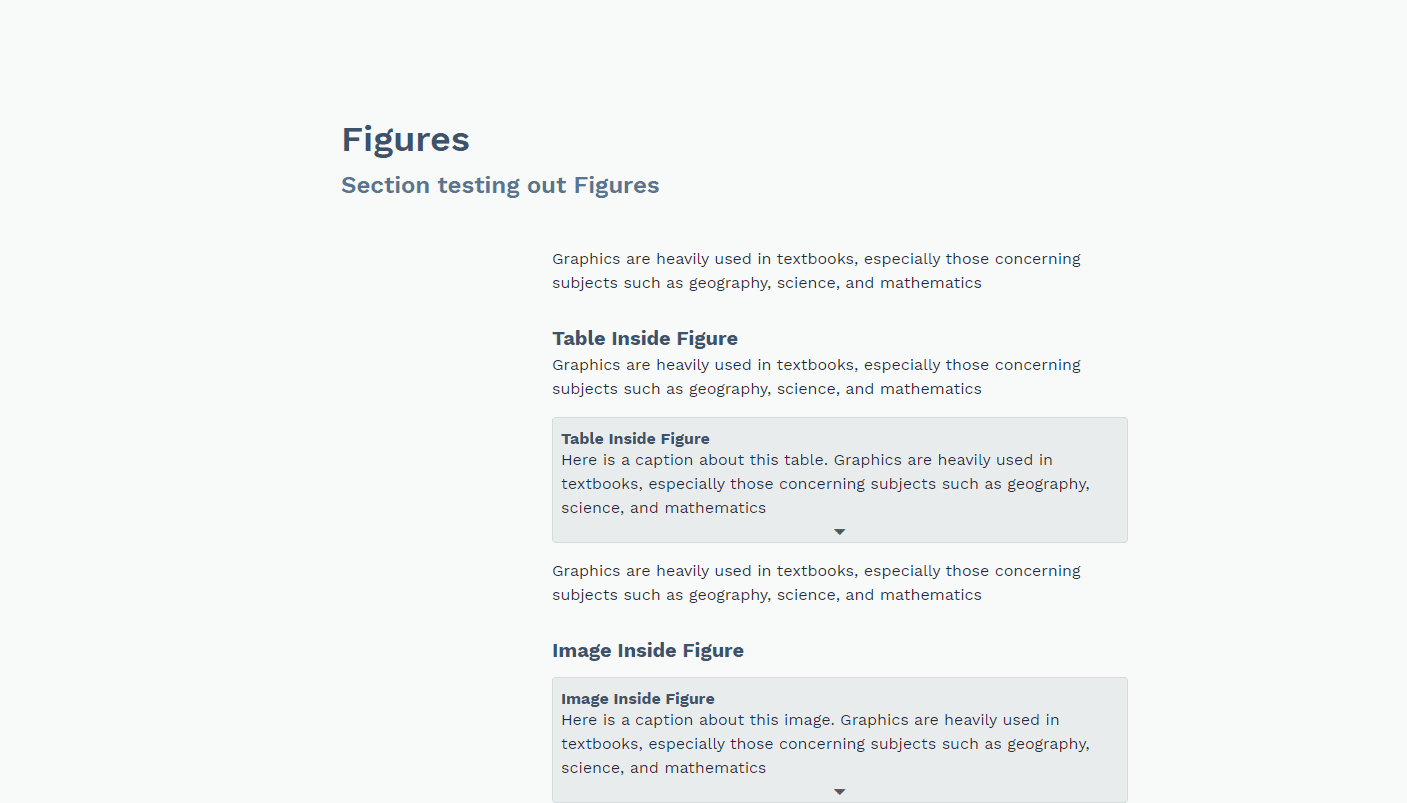
Aesthetically, the result looks better (to my eye). The colors are more focused and don’t “stray” around the spectrum.
Overall, there should be a slight improvement in contrast of text against the background.
The resulting design guidance will help make sure that colors are no longer assigned arbitrarily.
Additionally, the code can now support more ambitious design efforts, like a color scheme overhaul or adding themes (dark mode, anyone?).
Above the fold


Article
Figures
