Iteration 3
July 16, 2021
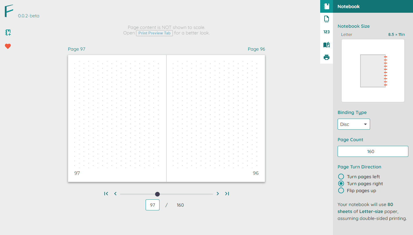
Iteration Overview
Changes
| Change | Intent |
|---|---|
| New name, color scheme | Establish Folio Forge’s brand |
| Landing page | Introduce Folio Forge’s functionality |
| Introduce tabbed navigation | Better organization of the application’s functionality |
| Add templates | Let the user get started quickly |
| Small tweaks throughout | Accommodate what was feasibly implemented |
Inputs informing this iteration
- Feedback from numerous peer reviews
- Design audit of the previous iteration
Establishing Folio Forge’s Brand
Mood & Theme
Some themes relevant to branding:
- homemade
- self-created
- the pride of “I made this myself.”
The Name Folio Forge
Using the Lotus Blossom technique , I brainstormed many names, 80% of them terrible.
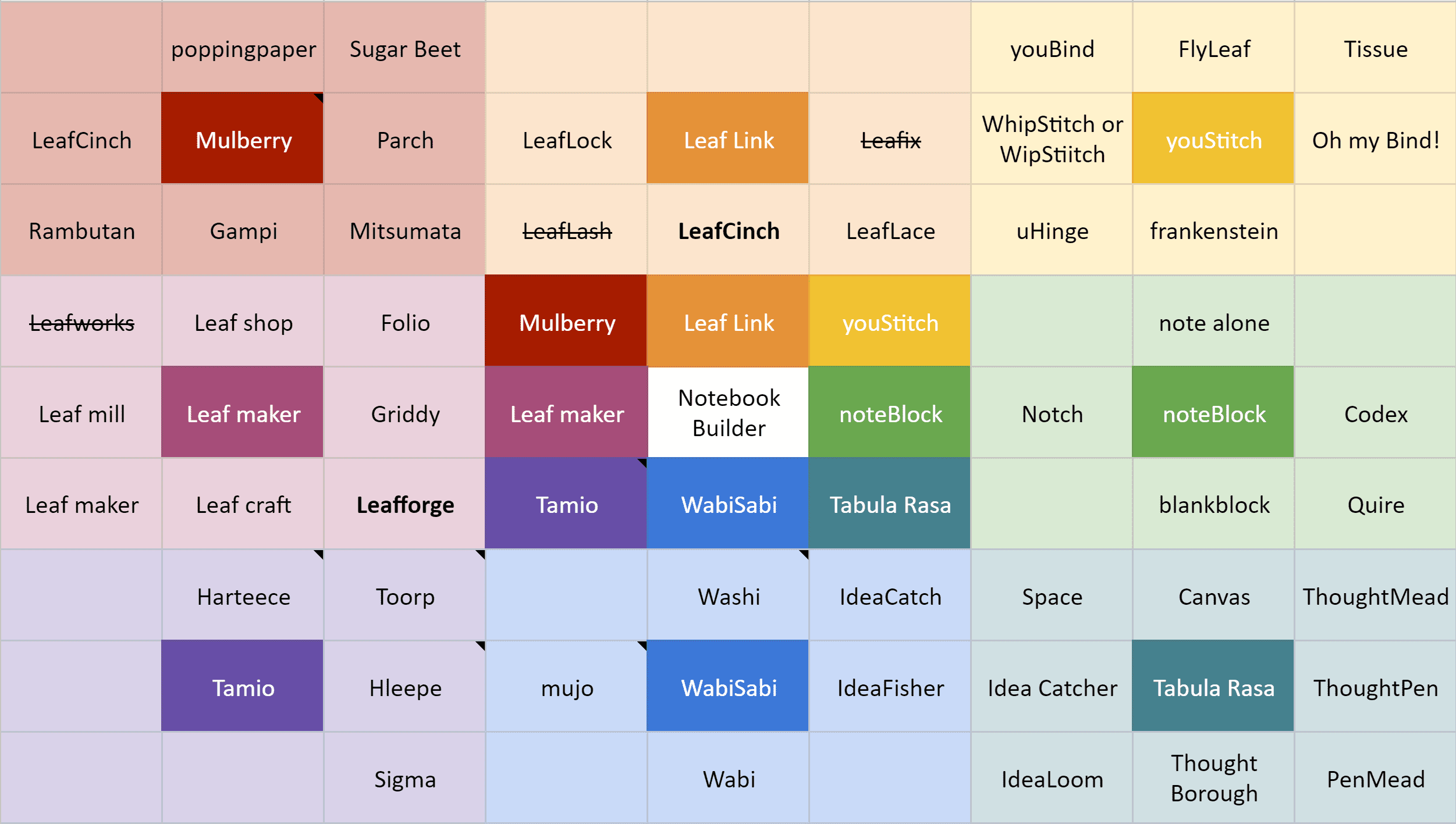
LeafForge was the most promising result from the Lotus Blossom exercise, but in the end, I went with Folio Forge because I liked the definition of ‘folio’. It seemed to fit best with the service provided. The “forge” was chosen because of the association with making and the alliteration with Folio.
Lastly, the folioforge.app domain was available, so I snatched it up.
Color
I chose a color palette associated with plants, focusing on greens of the palette because folio has a root meaning of “leaf”.
Typography
I wanted it to look approachable, friendly, and helpful. Thus I chose the rounded geometric sans Quicksand for the typeface.
Logo
In earlier iterations, the Folio Forge logo was a leaf.
Past iteration of the branding, with old name and logo.
But to me, it looked too generic and not immediately associated with its ability to create notebooks.
Finally, after some iteration, I came up with the following look:
Notebook Customization
Choose a template
With so many permutations of what the notebook maker could configure, it would be helpful if the notebook makers could select the starting point closest to what they wanted to make.
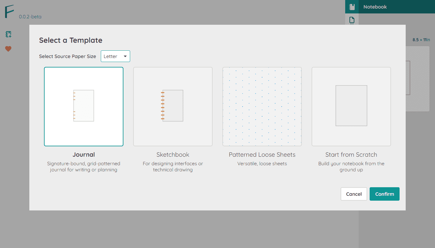
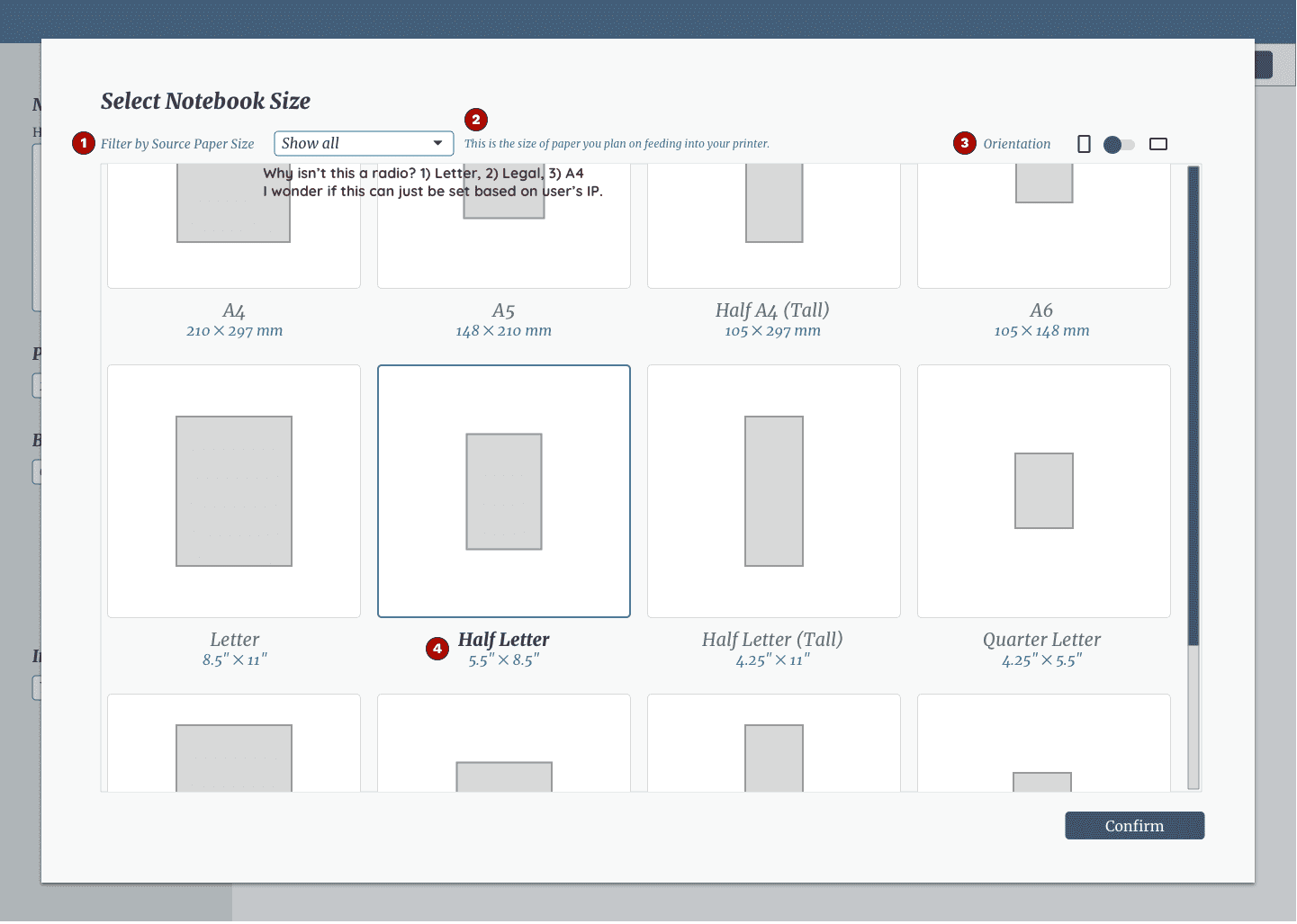
Choose a notebook form factor
With the Notebook Dialog, I previously had the notebook maker dial-in orientation, number of pages per sheet, page size, and page orientation as separate variables. Then I realized the UI could do better at “speaking the language” of notebook makers. For example, I observed people refer to their notebooks on social media and notebook shopping websites regarding the size and number of pages. I then adjusted the design to show a gallery of possibilities rather than the fiddlier approach of the previous iteration.
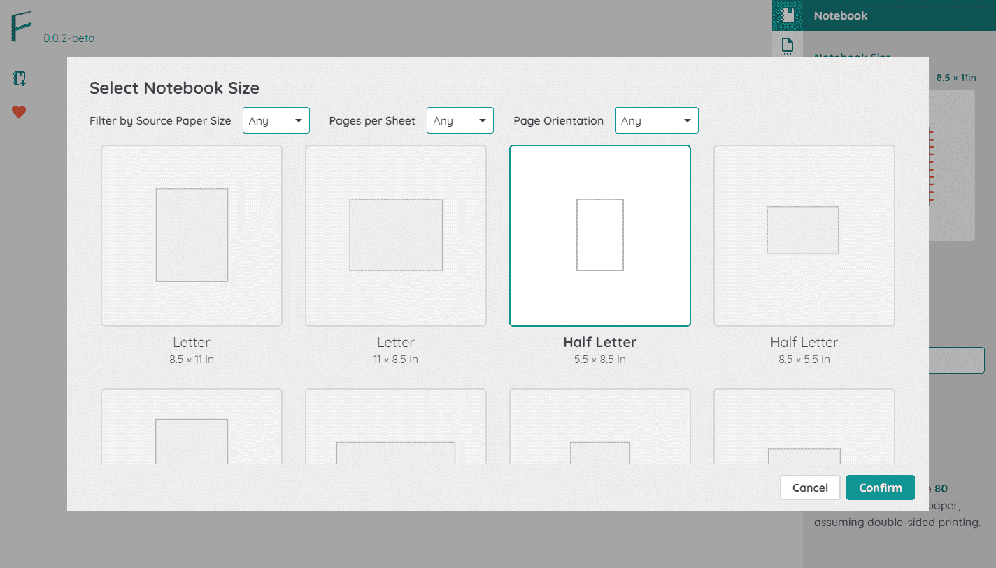
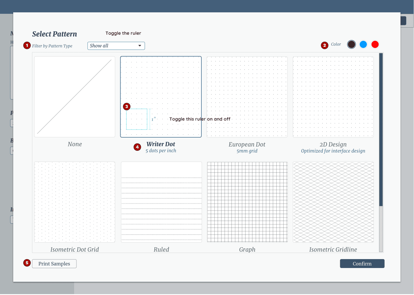
Choose the print pattern
I observed a handful of patterns in various “filler paper” and created a minimal set to provide notebook makers. However, as mentioned on the Landing Page, I intend to add more patterns to the collection.
The notebook maker can set the pattern’s color to make the writing or artwork stand out better. For example, I discovered that an artist could draw with black ink against a light blue pattern and then more easily remove it from the scan in Photoshop.
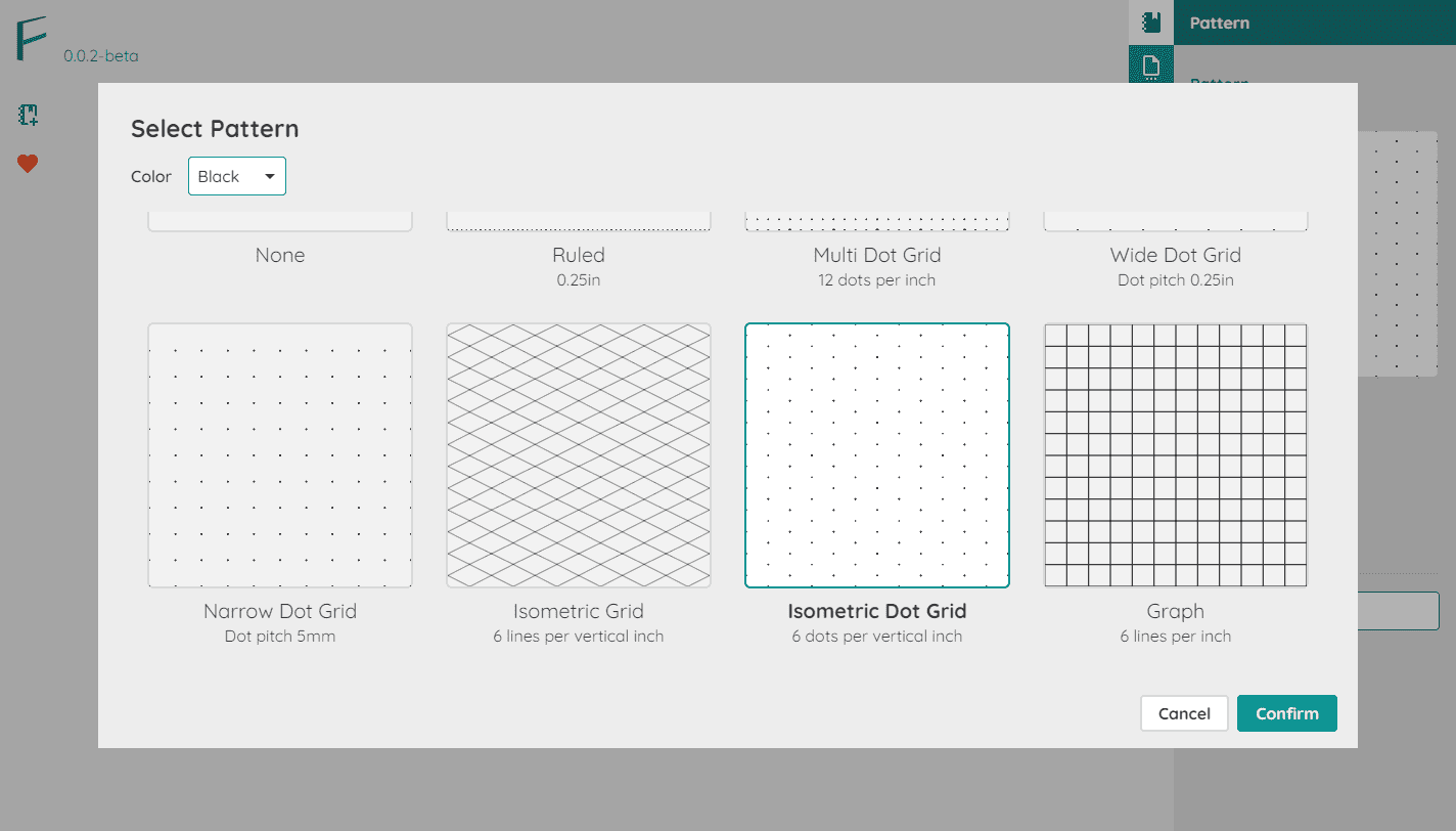
Application Main Screen
Real-time Feedback
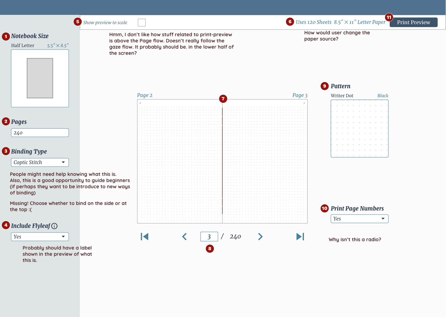
For every customization, I wanted the main screen to provide real-time feedback and allow the maker to preview their work, adhering to the design principle “Visualize the Result.”

Print Preview
I provide the notebook makers a second level of preview: the print preview, to help reduce the element of surprise, not to mention the frustration of wasting paper.
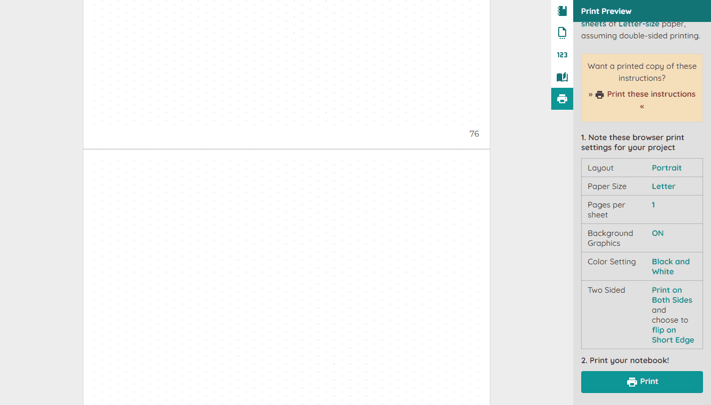
In a future iteration, I want to provide additional quick ways to get “feedback” on how things will look when printed. For example, print out a sample swatch page to help the notebook maker pick a pattern of choice.
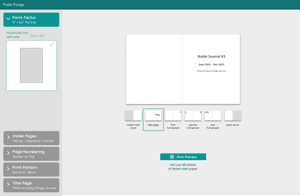
Custom Print Instructions
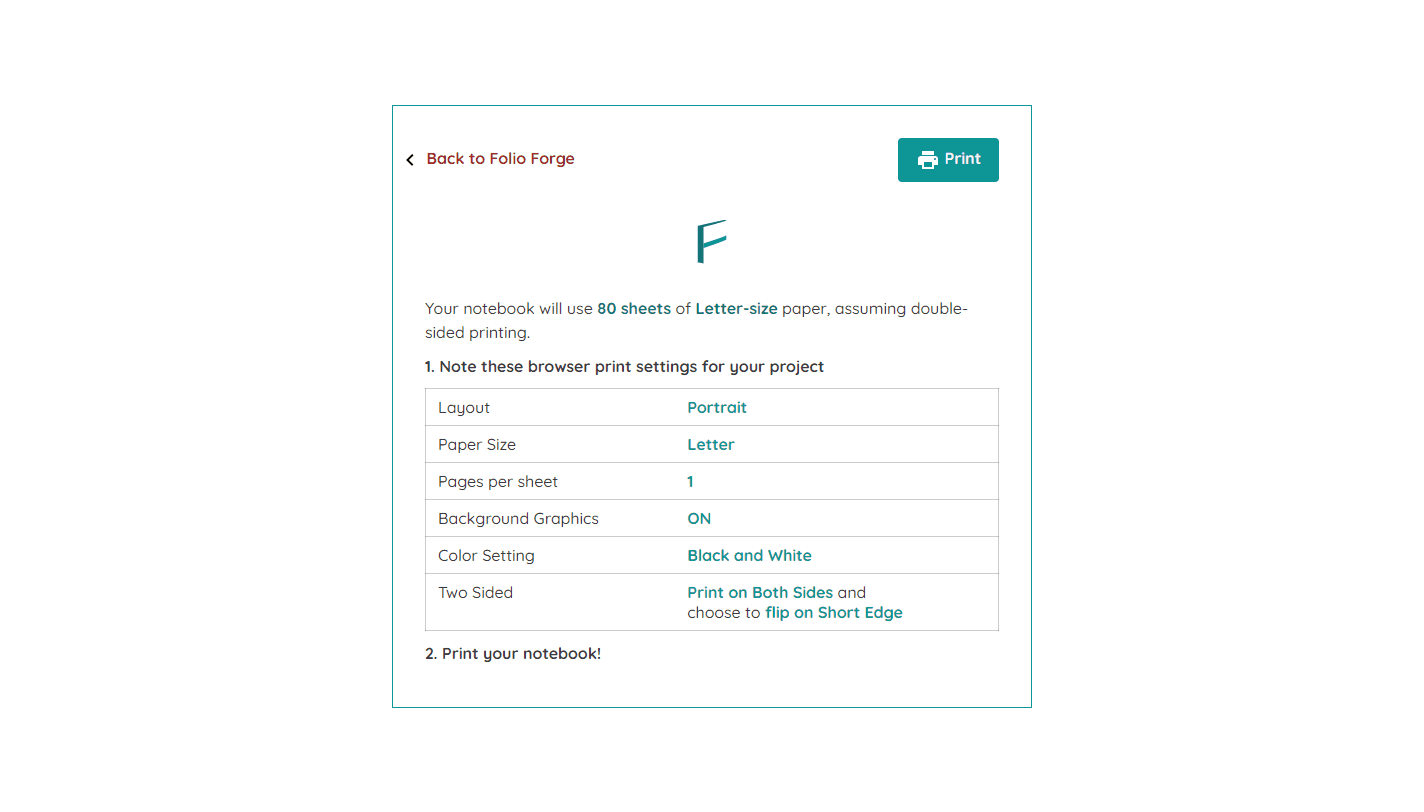
Dialing in the print settings can be a fraught process, where every setting needs to be defined just right, or else the printed output won’t match what the user desires. So, in the app, I provide customized print instructions to help ensure the success of the notebook maker.
Design Audit of the Previous Iteration
I annotated the screenshots of v2 with some changes to be made for this iteration:
