Iteration 4
September 10, 2022

Iteration Overview
Changes
| Change | Intent |
|---|---|
| New navigation | Make features more discoverable. |
| Add in-context help dialogs | Make the interface more accessible for new bookbinders (Nikki). |
| New Feature: title page | Build out an expected feature, implemented relatively easily. |
| Book navigation | Make navigation of the book less cumbersome and less glitchy. |
Inputs informing this iteration
- 3 peer reviews
- ~30 graduate students working in groups tested the app and wrote usability reports, graciously introduced through a colleague who taught user experience design at her local university. They provided the rawest of feedback, for which I was very grateful.
New Navigation
For greater feature discoverability
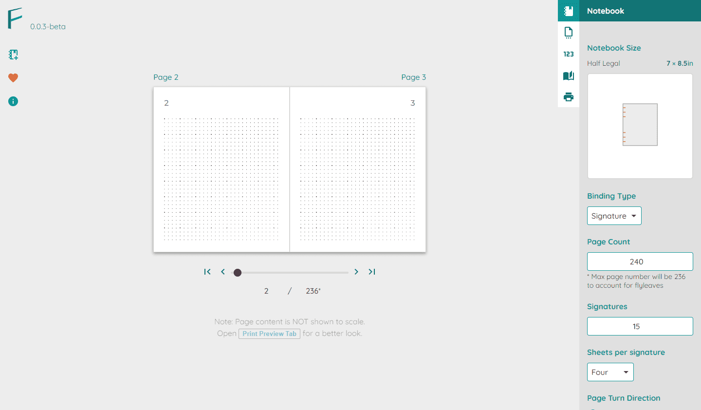
About half of the notes received from the usability reports centered around the discoverability of features. Participants did not easily find things such as changing the number of pages or setting the pattern.
Before
After
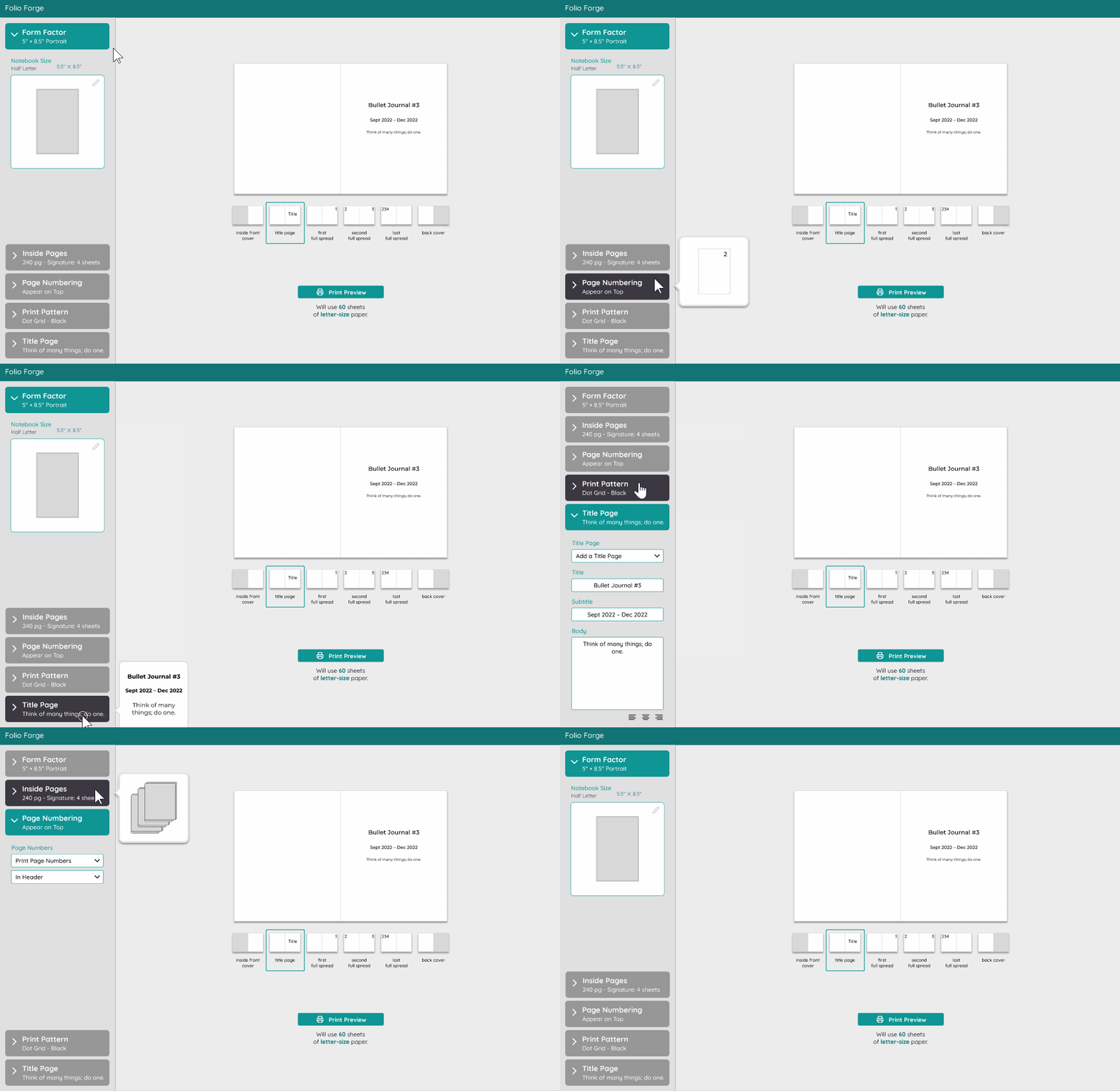
After: Folio Forge “feeds forward” more cues about tab contents, including a visual of the primary setting in each tab as the user hovers over it.
Instead of solely relying on hovering over icons to know what each tab is, the new iteration “feeds forward” with much more information:
- Title of the tab
- A summary of the settings
- A visual of the settings
Reorganization
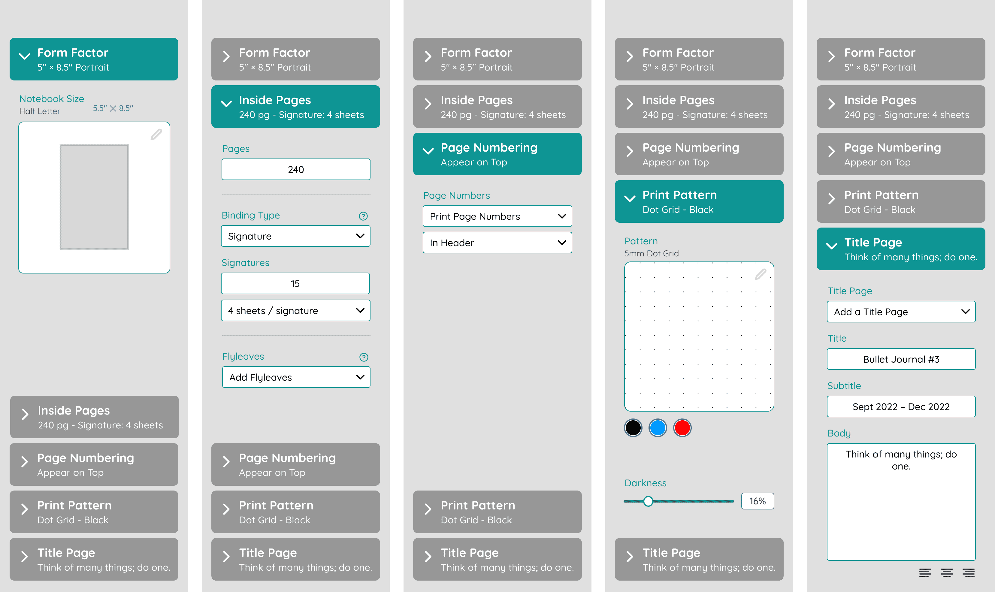
Additionally, I reorganized the controls to fit within fewer tabs.
In-Context Help
Addressing participant confusion about terms and features
In the usability studies, participants were confused at certain terms such as flyleaf, signature binding, page turn direction, etc.
To that, I added two help dialogs:
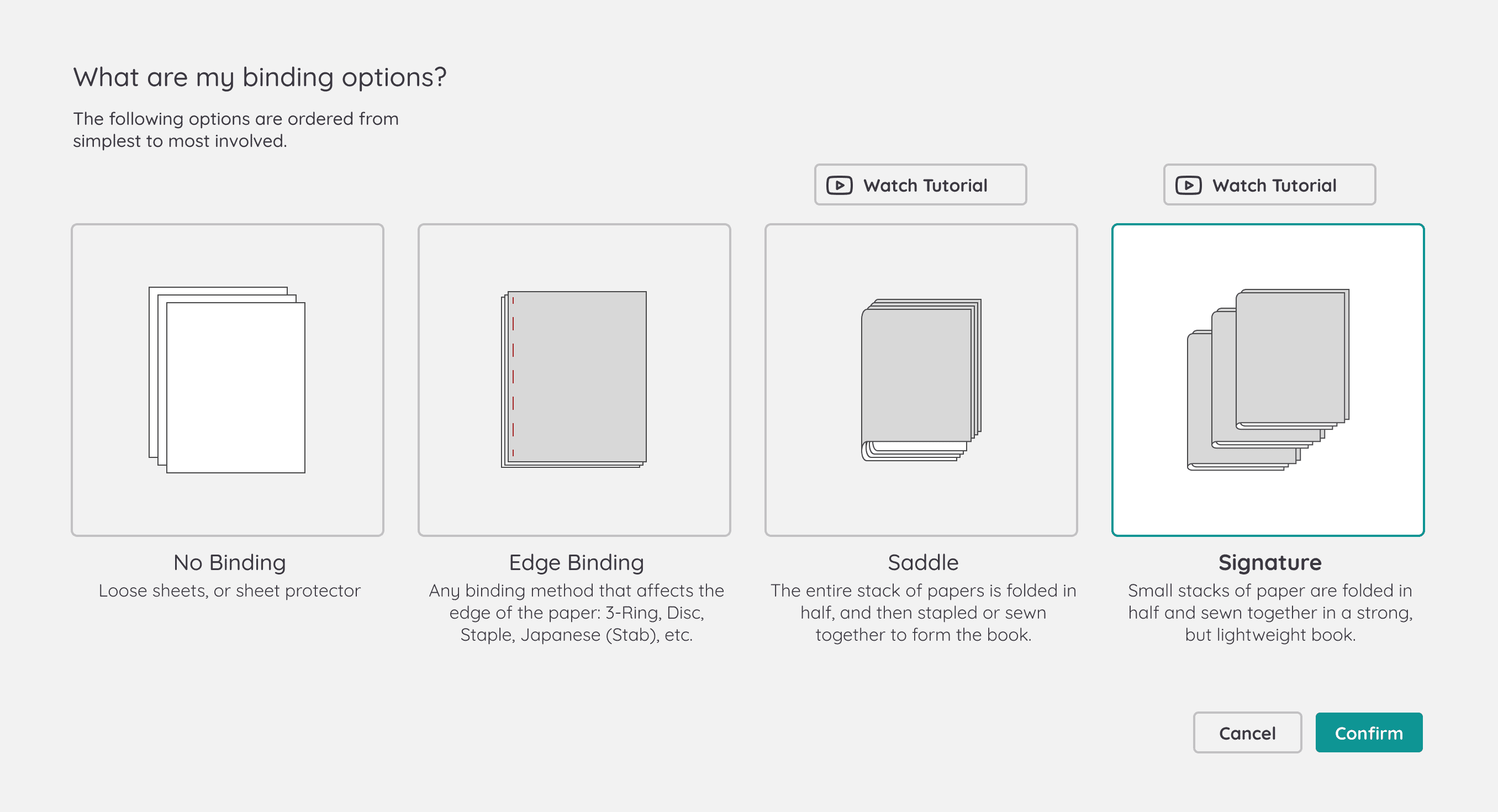
Binding Options
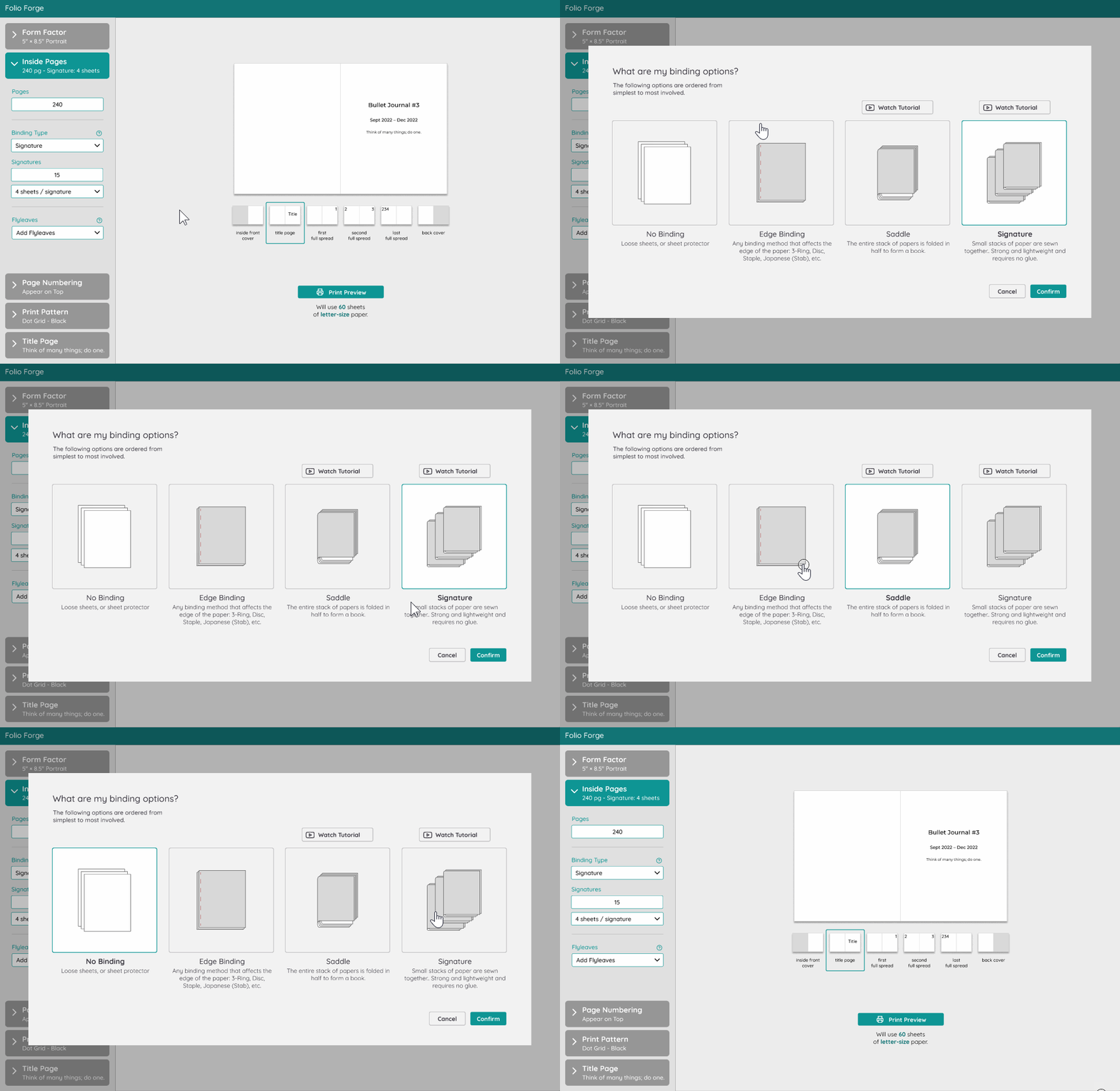
New binding options help dialog arrange the binding options from simple to complex and point to tutorials to find more information.
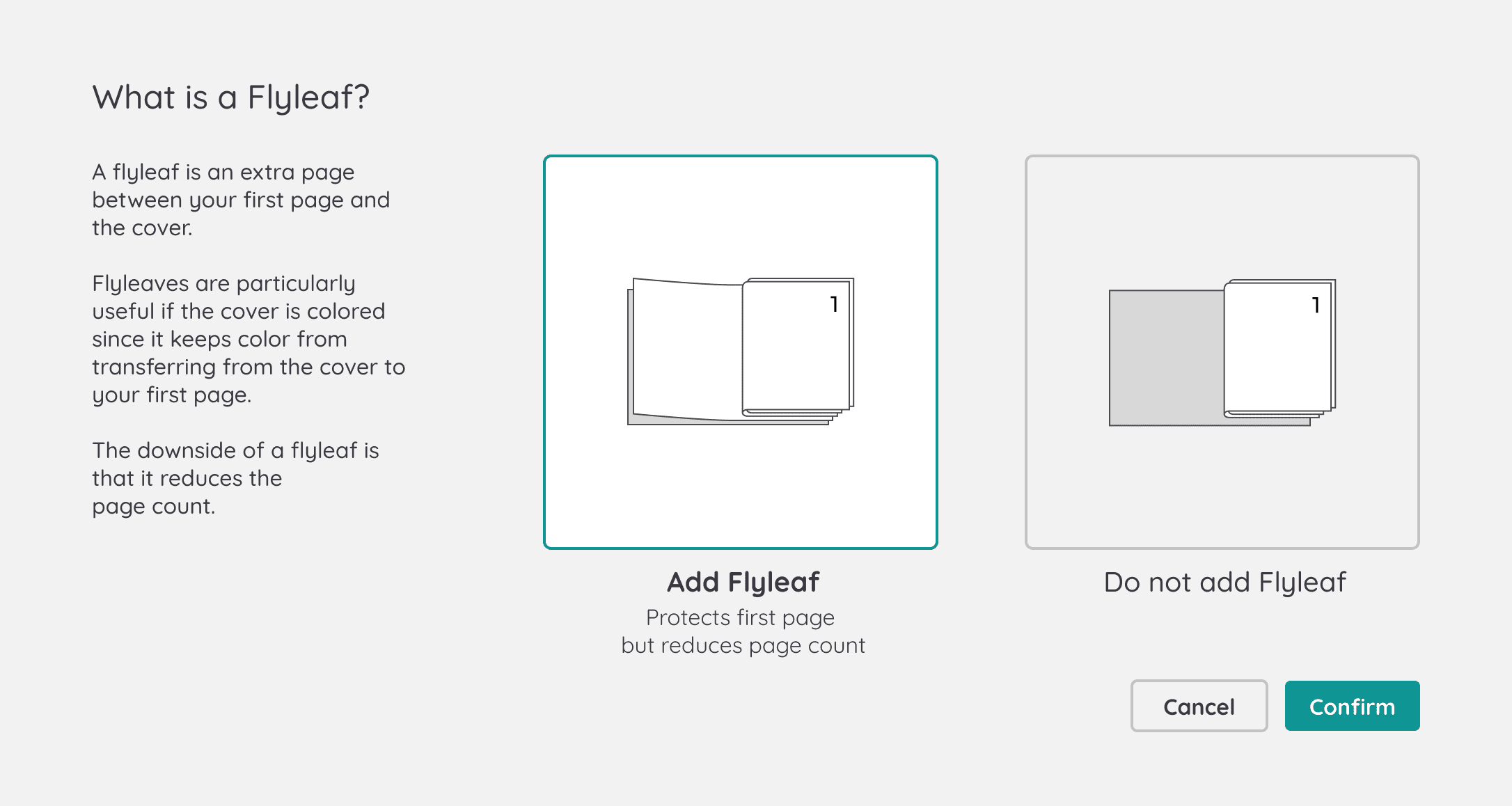
Flyleaf

Flyleaf is among many of the settings behind an unfamiliar term. The dialog helps visualize what the choices mean.
Microinteraction: More Streamlined Decision Support
As you see with the .gifs above, the pattern to be followed in these dialogs is that they are enlarged selectors. In other words, the user can make a selection after using the guidance, and the selection will propagate to the main app once they close the dialog.
Title Page
Including a title page was often requested in peer as well as participant feedback. I hypothesize that users will expect this feature given how common it’s found in manufactured notebooks. Additionally, it should be easy to implement. Therefore, I added it to this design iteration.
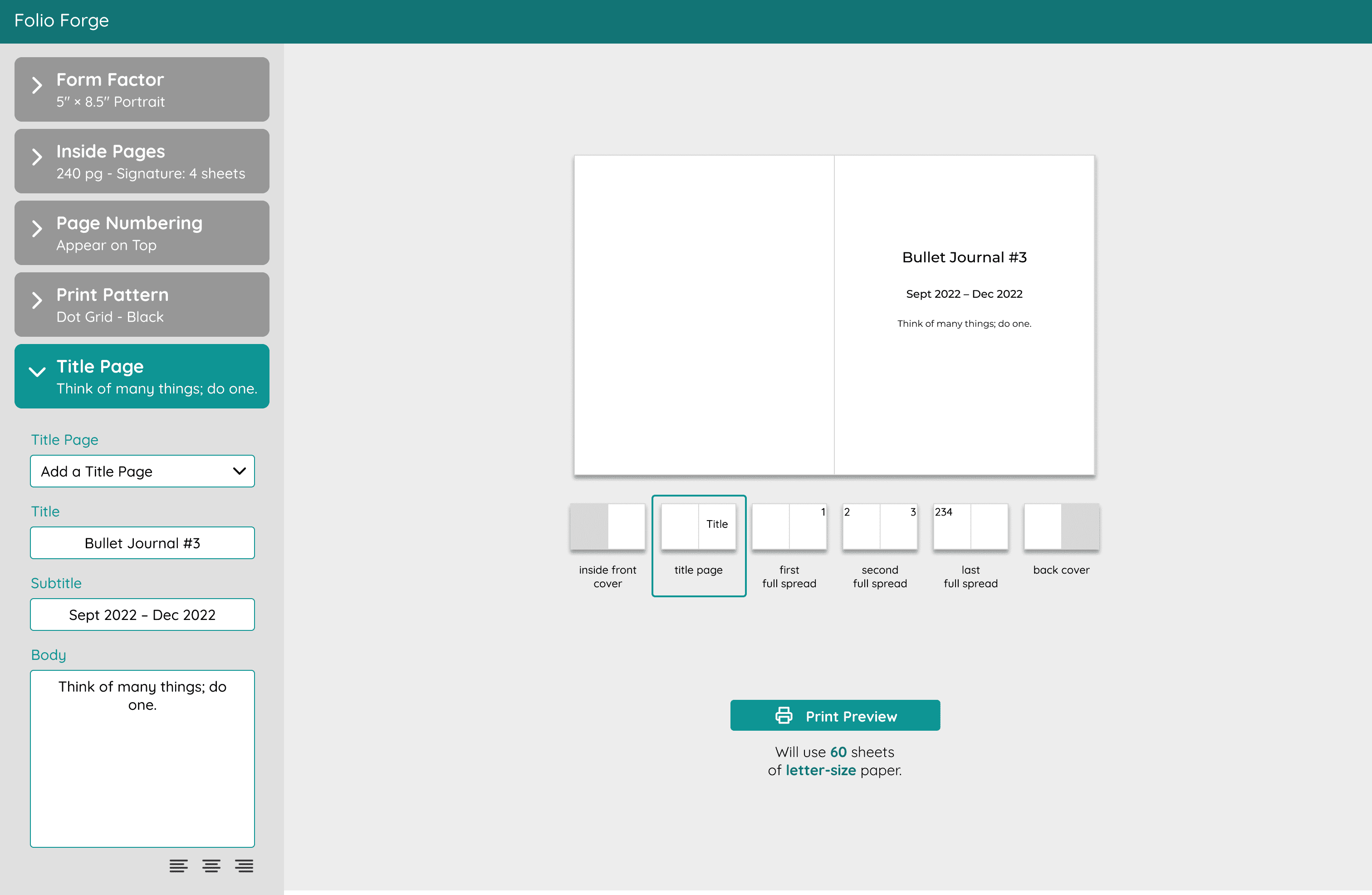
New Notebook Preview
The previous iteration used the standard page navigation control seen in PDF viewers: you type in a page to jump to and can arrow back and forth.
Not only was this strangely tricky to implement, but I also didn’t think navigating to arbitrary pages benefitted the user since all pages are identical.


Retrospective
I realized the number of new terms that Nikki, the new bookbinder, will encounter is high enough that I should add a design principle to the list:
New Design Principle
Visualize the options available to makers and guide them through their decision.
